AI Product Design · Enterprise B2B · 2026Client Concept · NDAResearch · UX · UI · Design System
NAVI: the financial wellness benefit that finds you in Slack.
Proactive AI financial wellness benefit concept embedded in Slack and HR portals, validated through 19 interviews and an 8-person prototype usability study.
Solo Product DesignerDiscovery · Synthesis · Product framing · Interaction design · Trust architecture · Visual design · Prototyping · Validation
- 38 sec
- observed prototype time to act
- 4.4 / 5
- directional trust rating · n=8
- 7 of 8
- adoption intent as workplace benefit
Financial stress is common. The tools meant to help rarely earn a second visit.
Companies pour money into financial wellness benefits. The programs exist. The tools exist. But employees don’t use them, because the tools are built wrong.
Scope note. NAVI is a client-context concept and public front-end prototype validated through research and usability testing. This page does not claim a production launch, production telemetry, or real employee data.
They’re designed like banking apps: clinical interfaces, data-heavy dashboards, cold blues. They make the anxiety worse instead of easing it. People enroll, open the app once, and never come back. The benefit itself isn’t the problem. Where it lives is.
“We offer a financial wellness program. Maybe 3% of employees actually use it.”
“I know I should budget, but it feels like homework. If it just told me when something was wrong, I’d actually pay attention.”
19 interviews. One finding that changed the whole product.
I talked to 7 HR managers and 12 individual employees across two mid-sized tech companies. I wanted to know why adoption was so low, and whether the problem was the product itself or the surface it lived on.
People don’t open finance apps
Every employee I talked to already had a finance tool: Mint, their bank app, a budget spreadsheet. None of them opened it regularly. Nine of twelve said some version of “I live in Slack.”
Embarrassment blocks activation
HR managers told me that branding something “financial wellness” makes people avoid it. Nobody wants coworkers knowing they signed up. An embedded tool sidesteps that: nothing to download, nothing visible.
Proactive beats reactive
Over and over, people said they wanted to be told when something needed attention, not to go looking for it themselves. “If it just pinged me when I was off track, I’d trust it more than any dashboard.”
Research artifact · redacted interview synthesis
What the notes said, and what changed because of it.
Anonymized synthesis from 19 structured interviews: 7 HR leaders and 12 employees across two mid-sized technology companies. Identifiers are removed; this is a working synthesis, not a reconstructed transcript.
| Source | Observed signal | Design consequence |
|---|---|---|
| Employees · 9 of 12 | “I live in Slack.” | Put the benefit where attention already lives instead of asking people to open another finance app. |
| Employee interview | “I know I should budget, but it feels like homework.” | Replace a recurring budgeting chore with a short, proactive signal when something needs attention. |
| HR manager interviews | Financial-wellness branding made the benefit feel visible and uncomfortable to activate. | Keep personal participation private and make the entry point feel like an existing workplace tool. |
| Cross-interview theme | People wanted to be told when they were off track, not to search for problems themselves. | Rank one actionable insight above raw transactions and connect the consequence to the active goal. |
Scannability aid · insight → decision
A compact reading aid, not new research. It summarizes how the three interview insights changed the product direction.
| Insight | Decision |
|---|---|
| People don’t open finance apps | Embed NAVI where attention already lives. |
| Embarrassment blocks activation | Keep participation private and make the entry point feel like an existing workplace tool. |
| Proactive beats reactive | Rank one actionable insight above raw transactions and kill the exploratory dashboard. |
Seven decisions that define the product.
The evidence is separated deliberately: research-supported decisions come from the interview synthesis, usability-supported decisions come from the prototype sessions, and design hypotheses remain hypotheses. The embedded surface is a constraint, not proof that every visual choice was independently validated.
Research-supported · Claymorphism, not flat UI
My first visual pass was a dark, sharp fintech UI. It looked credible to me, but the first two test participants both called it “another bank app” unprompted. That reaction is exactly the avoidance the research warned about, so I threw the pass out. Soft 3D dome shadows, rounded clay surfaces, and sky-blue backgrounds create the “best friend who happens to know finance” register instead. Participants described the warmer treatment as more approachable; I can’t isolate it as a single causal driver of the directional trust rating.
Research-supported · "NAVI ANALYSIS," not "NAVI says"
Version one used chat bubbles with a friendly “NAVI says…” voice. In a workplace benefit it read as a toy, and one participant asked if it was “like a customer service bot.” That comment killed the pattern. Every AI output became a labeled “NAVI ANALYSIS” block with a confidence percentage and a data source citation: system credibility, not personality. Testing participants described the rework as feeling “like a report from a trusted system.”
Usability-supported · Human override on every card
NAVI never acts. It proposes and waits. Every recommendation card has an Override button, a non-negotiable design rule. Financial anxiety peaks when people feel out of control. The override button is a design promise: the human is always in charge. During one exploratory iteration, removing human override coincided with weaker trust responses. I can’t verify a participant subset or procedure that would support a defensible delta, so this remains directional input for retaining user control, not an independent experimental result.
Design hypothesis · The computed timeline, never a round year
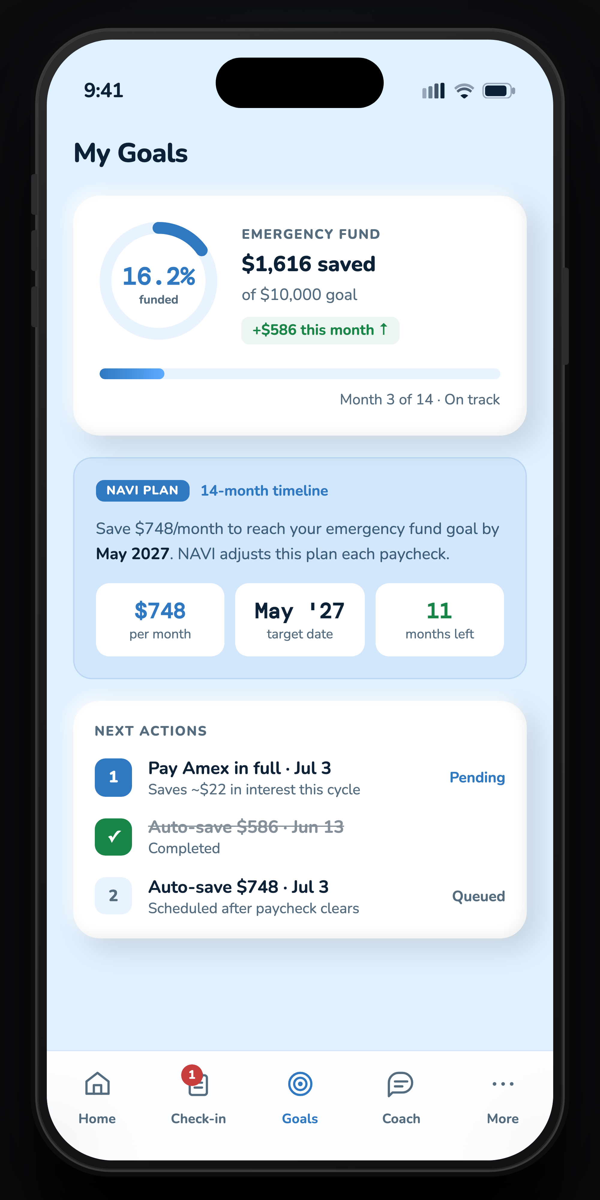
NAVI never rounds a savings plan to a clean year. It shows whatever the math actually produces, 14 months on the $10,000 emergency-fund goal in this prototype. My bet: a flat 12-month plan reads like a New Year’s resolution, and those have a reputation for not sticking. An odd number is counterintuitive enough to be memorable, and it signals that NAVI computed a real timeline rather than rounding to a year. This is a design hypothesis, not a validated dropout study; I haven’t tested the claim itself, only that people notice the computed timeline.
Usability-supported · Confidence scores everywhere
Every AI recommendation shows a confidence percentage and the data behind it. Being upfront about the reasoning cuts down skepticism, people actually engage with it instead of dismissing it outright. Participants spent noticeably more time on cards with a confidence breakdown, and rated them as more trustworthy even when the score was only 74%.
Research-supported · Privacy as a first-class surface
The Privacy & Data screen is reachable within two taps from anywhere. It shows exactly what NAVI accessed, and just as critically, what it did NOT access. Negative disclosure (“NAVI cannot see your performance reviews or health claims”) was the most trusted copy in testing. The employer view is aggregate-only and requires a cohort of at least k ≥ 5; individual balances, debts, merchants, and goals never appear in HR reporting.
Design hypothesis · Agentic triggers stay explainable
The concept’s decision specification starts with a payroll deposit webhook and a read-only transaction batch. NAVI reviews discretionary spend against a 90-day category baseline and raises an anomaly review above 1.5× that baseline. The recommendation shows how the overage changes the active goal timeline, plus confidence signals from category consistency and recurring-merchant history. NAVI proposes and waits; it never moves money on its own.
The dashboard I had to kill.
Not everything made it. This is the first dashboard I designed after the pivot, and it’s the wrong product wearing the right logo.
V1, killed in review
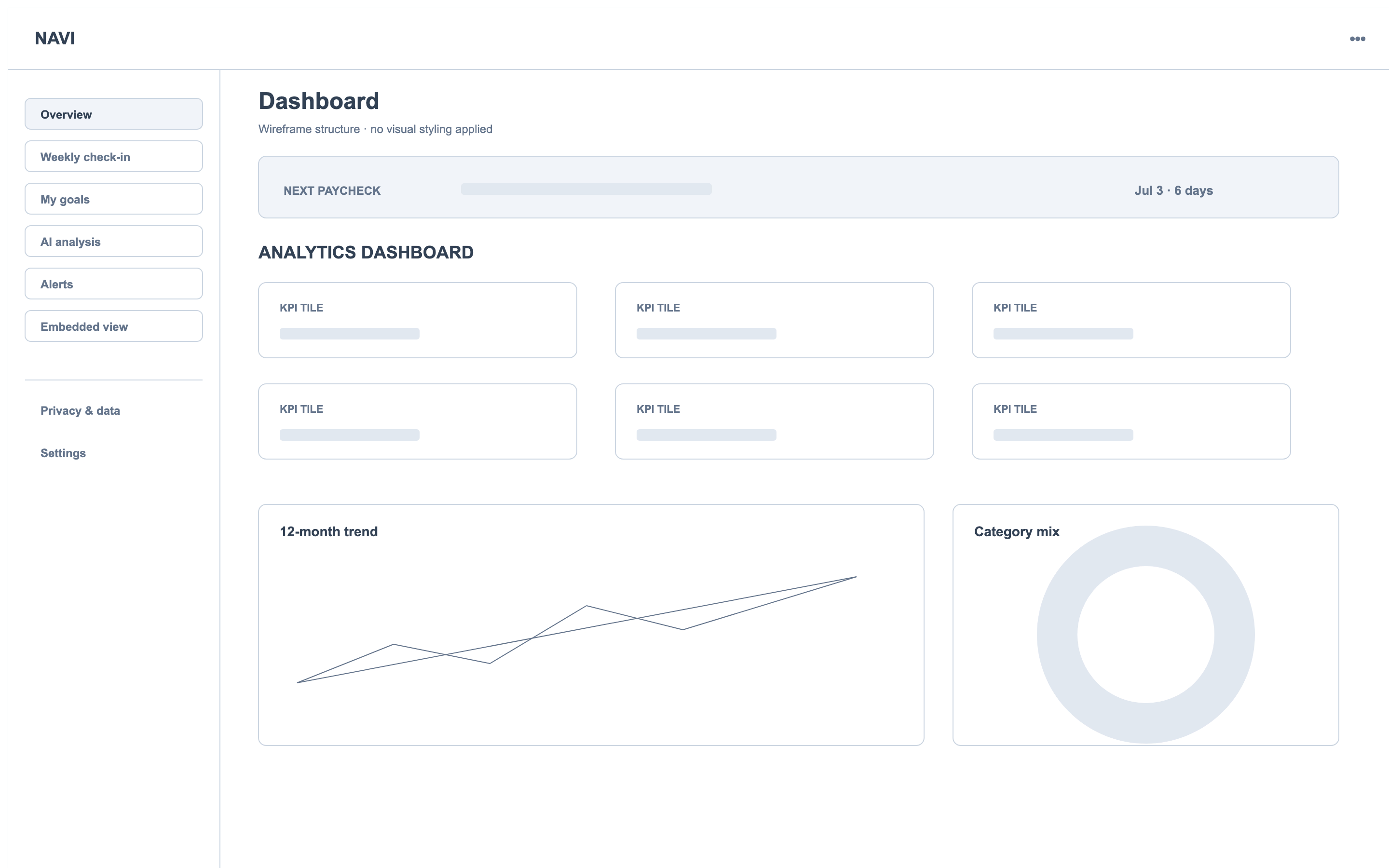
Six KPI tiles. A 12-month trend line. A category donut. A merchant heatmap. A forecast band. It looked like a serious analytics product, and I was proud of it for about a week. Two things killed it:
It couldn’t survive Slack
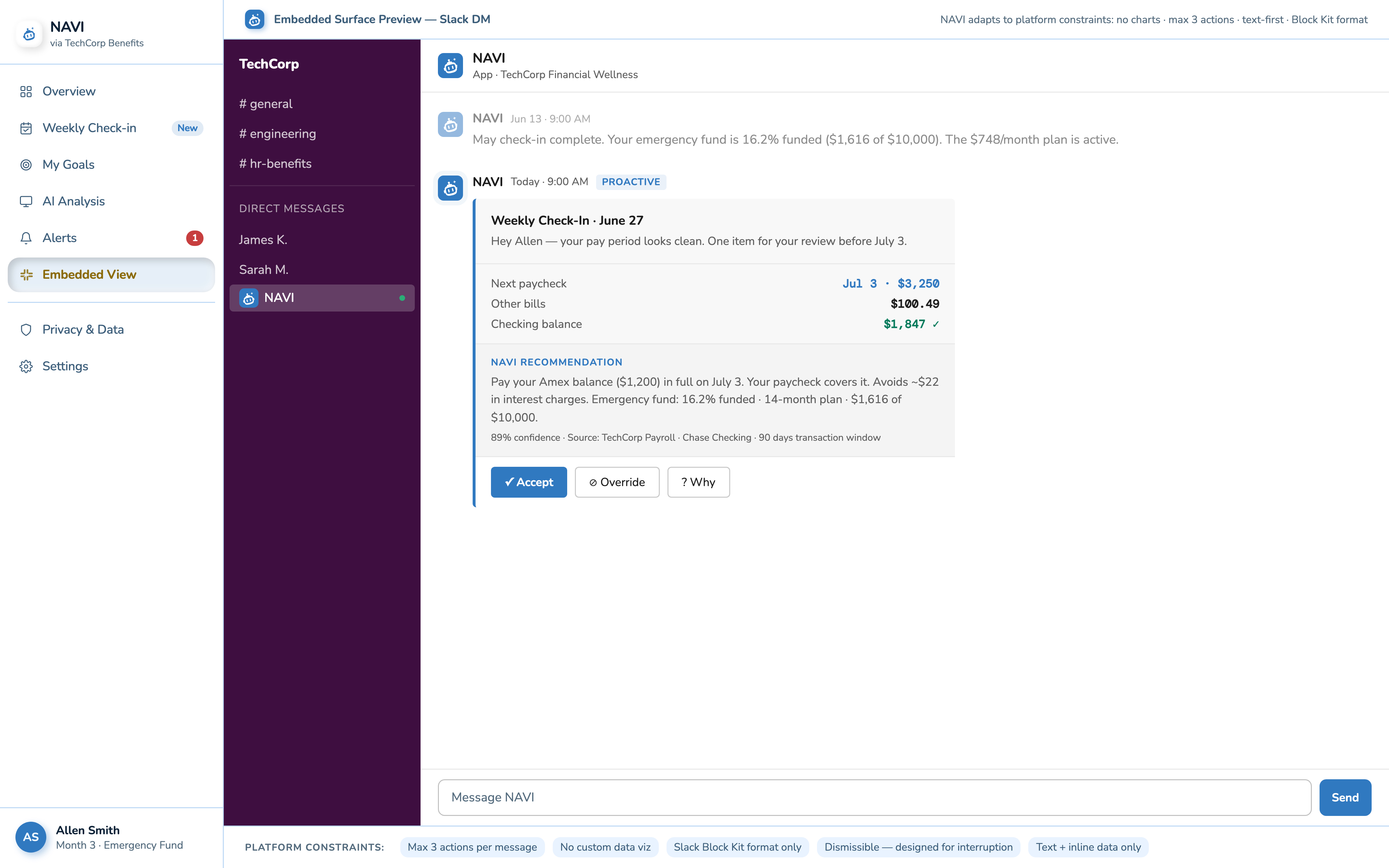
For this concept, I treated Slack’s Block Kit surface as text-first, with no custom charts and no more than three actions. Those are the constraints recorded in the project payload spec; this page demonstrates a Block Kit-style simulation, not a deployed Slack integration. Every panel on this screen assumed a canvas the primary surface just doesn’t have. If the dashboard’s whole value was in its charts, the embedded version would always be the weaker sibling, which is backwards when embedded is supposed to be the point.
The research had already voted against it
Insight 03 was “proactive beats reactive”: people wanted to be told when something needed attention, not to go exploring. This screen is a machine for exploring. It asks the user to do the analysis NAVI was supposed to do for them.
What replaced it: one paycheck banner, one insight card with an action, one spending list. The final dashboard tells you what NAVI found. This one asked you to go find it yourself.
From lo-fi to final, web and mobile.
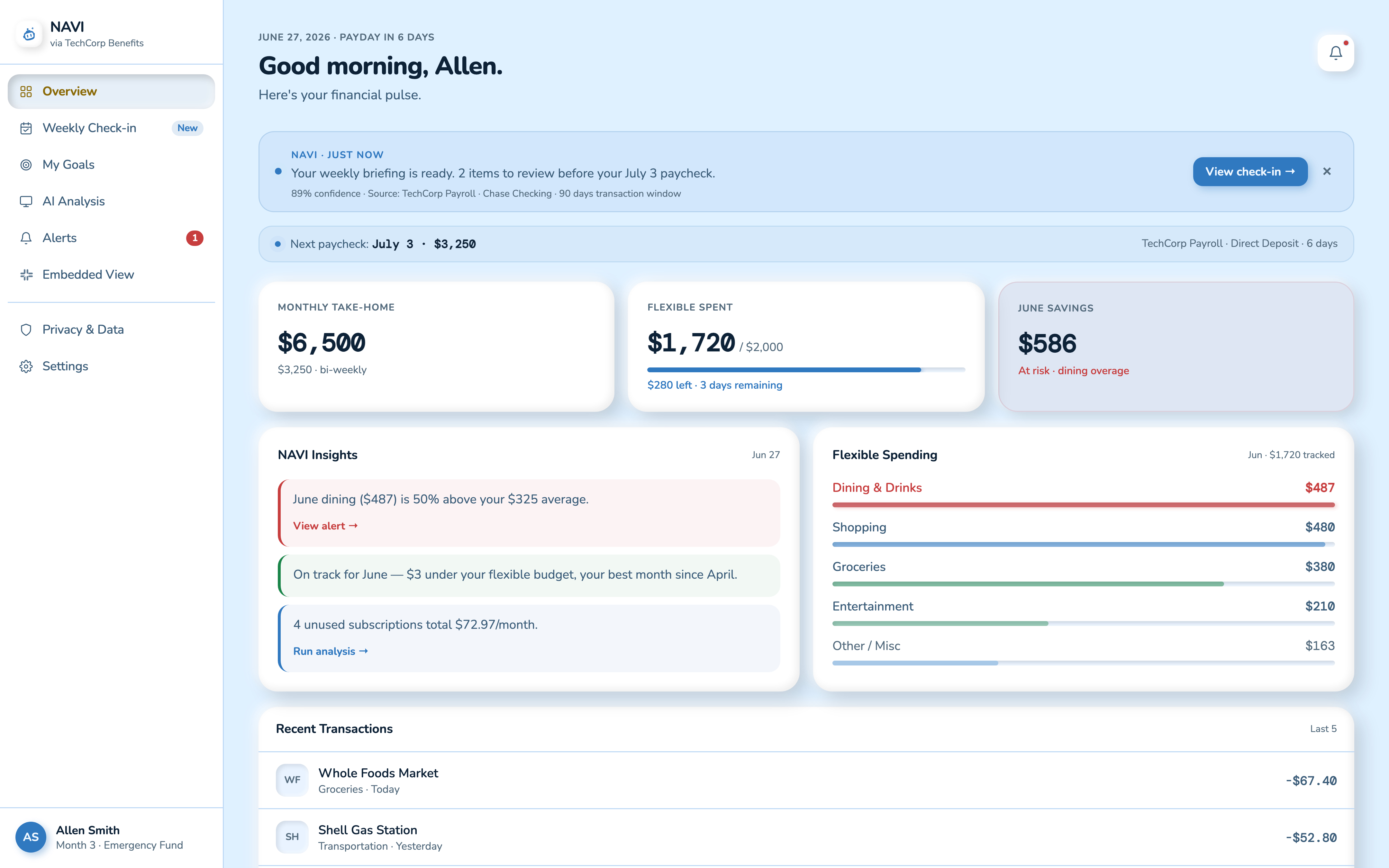
The dashboard shows the clearest progression on both surfaces. Paycheck-first layout and the proactive AI banner were locked in at the wireframe stage and never changed. Only the visual system got layered on top later.
Web dashboard
Lo-Fi
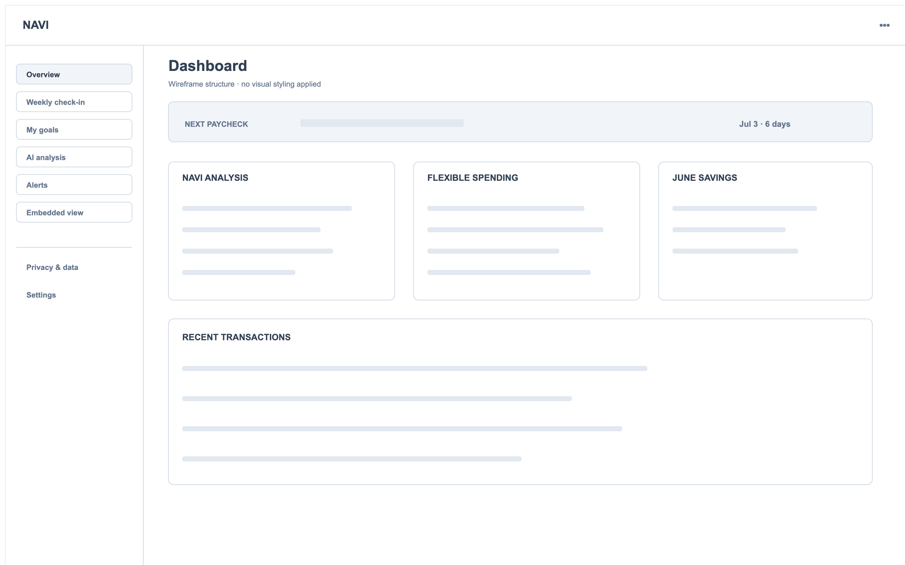
Final UI
Mobile dashboard
Lo-Fi
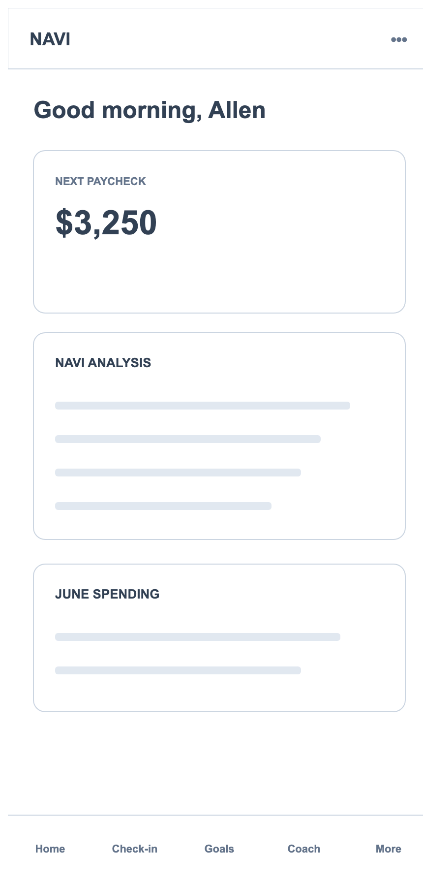
Final UI
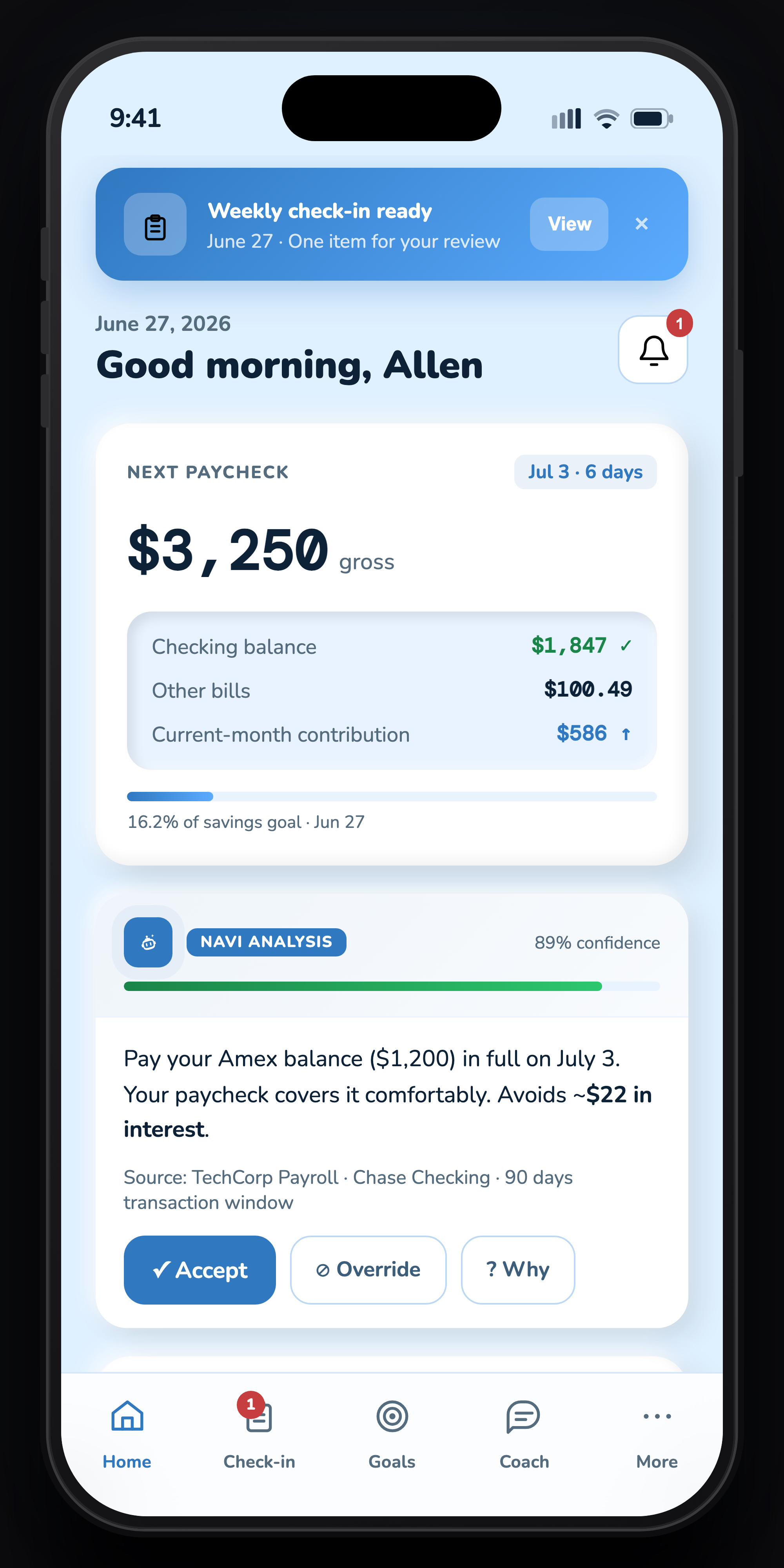
Every numbered dot is an interview finding.
Research isn’t a separate section tacked onto this product, it’s load-bearing. These are the two screens where the interviews shaped the most pixels, each one annotated with the specific finding behind it.
- The briefing banner speaks first. Insight 03: “if it just pinged me when I was off track, I’d trust it more than any dashboard.” NAVI opens the conversation; the user never has to go looking.
- Paycheck is the anchor, not net worth. Every employee interviewed oriented their financial thinking around the next pay date, not a balance. The paycheck strip sits above everything else on the page.
- Insights outrank transactions. In the killed v1 this space was a trend chart. Interviews said users don’t want to analyze, so NAVI’s conclusions got the prime slot and raw transactions moved below the fold.
- An at-risk number is tied to a goal. Participants ignored generic warnings but reacted to consequences. “June savings at risk” links the overage directly to the emergency-fund timeline.
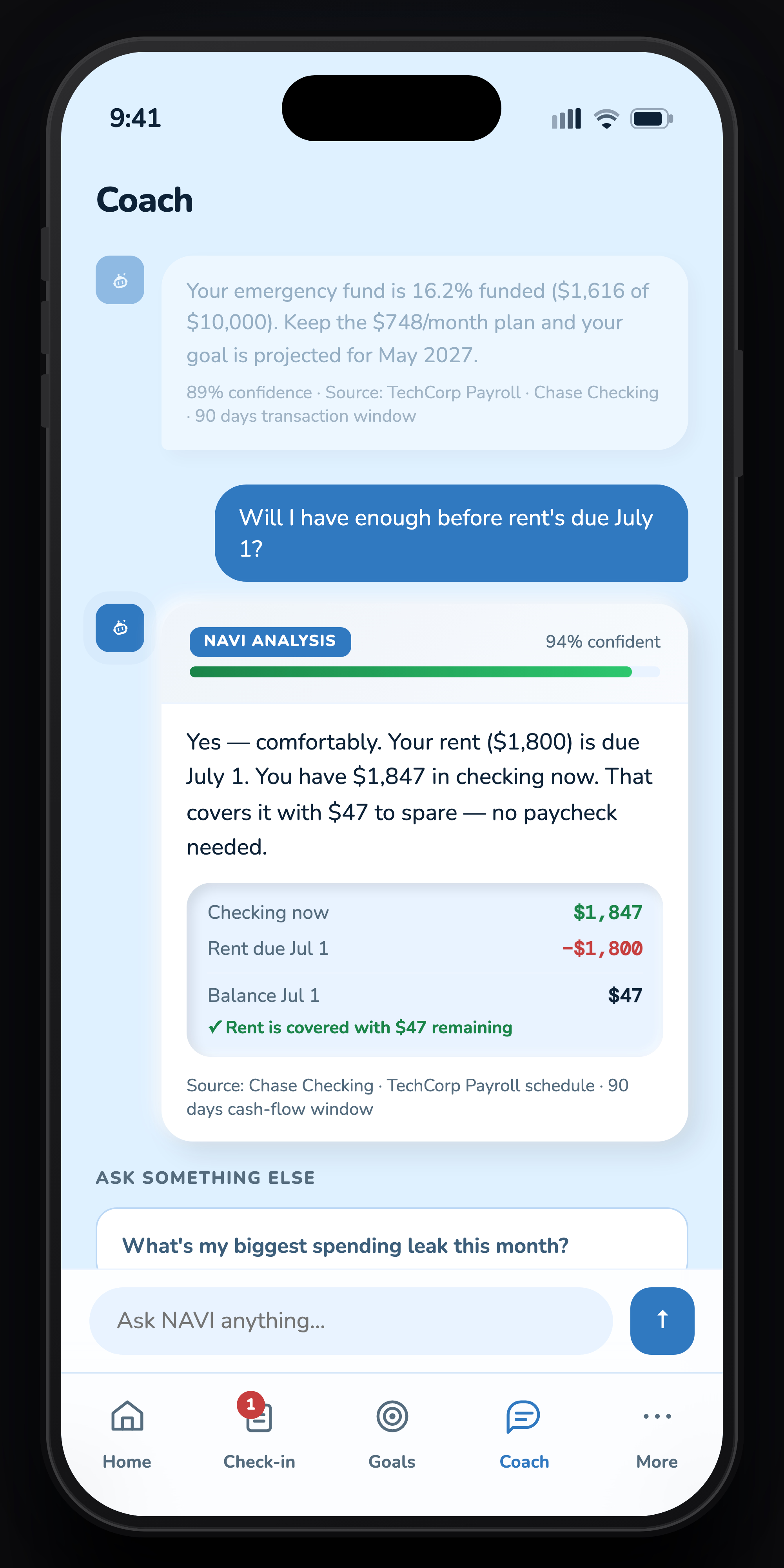
- Confidence percentage on every answer. Participants rated recommendations as more trustworthy when a confidence score was visible, even when the score was only 74%. Hiding uncertainty reads as hiding something.
- The math is shown receipt-style. “Like a report from a trusted system.” The answer includes checking balance, rent due, and the resulting number, so the user can audit the reasoning instead of taking NAVI’s word.
- Suggested prompts kill the blank page. The wireframe phase surfaced “what do I even ask?” anxiety. Ready-made follow-ups mean the coach never presents an empty input field as the only path forward.
Eight screens. One visual language.
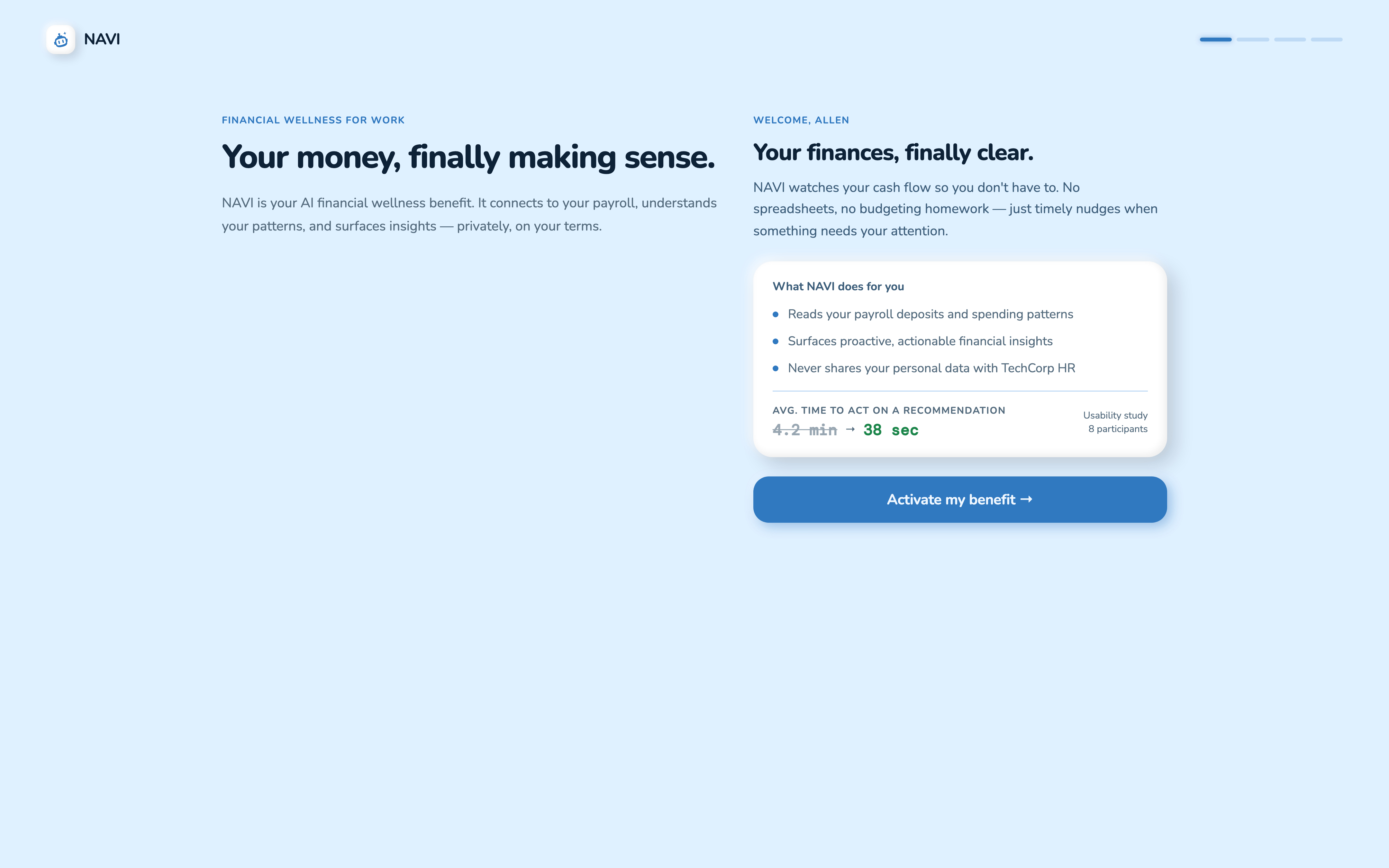
The public front-end prototype covers the concept’s standalone portal, from onboarding through privacy controls. The claymorphism system holds across every screen: same shadow formula, same card radius, same palette. No production services or employee data are included; client and participant details remain private under NDA.
Defined a framework-independent design-token system supporting consistent, white-label experiences across surfaces.
The app shell, six screens, one sidebar
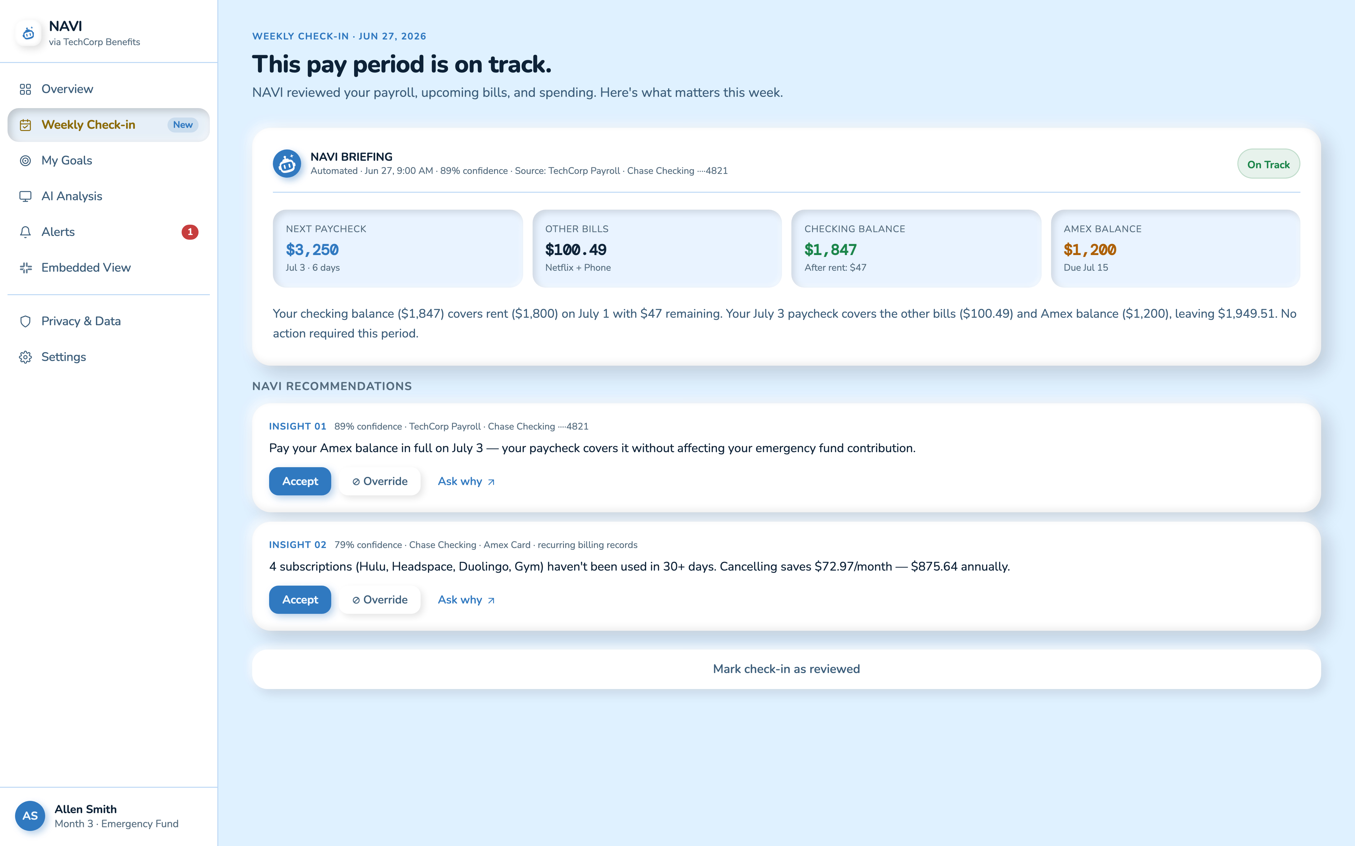
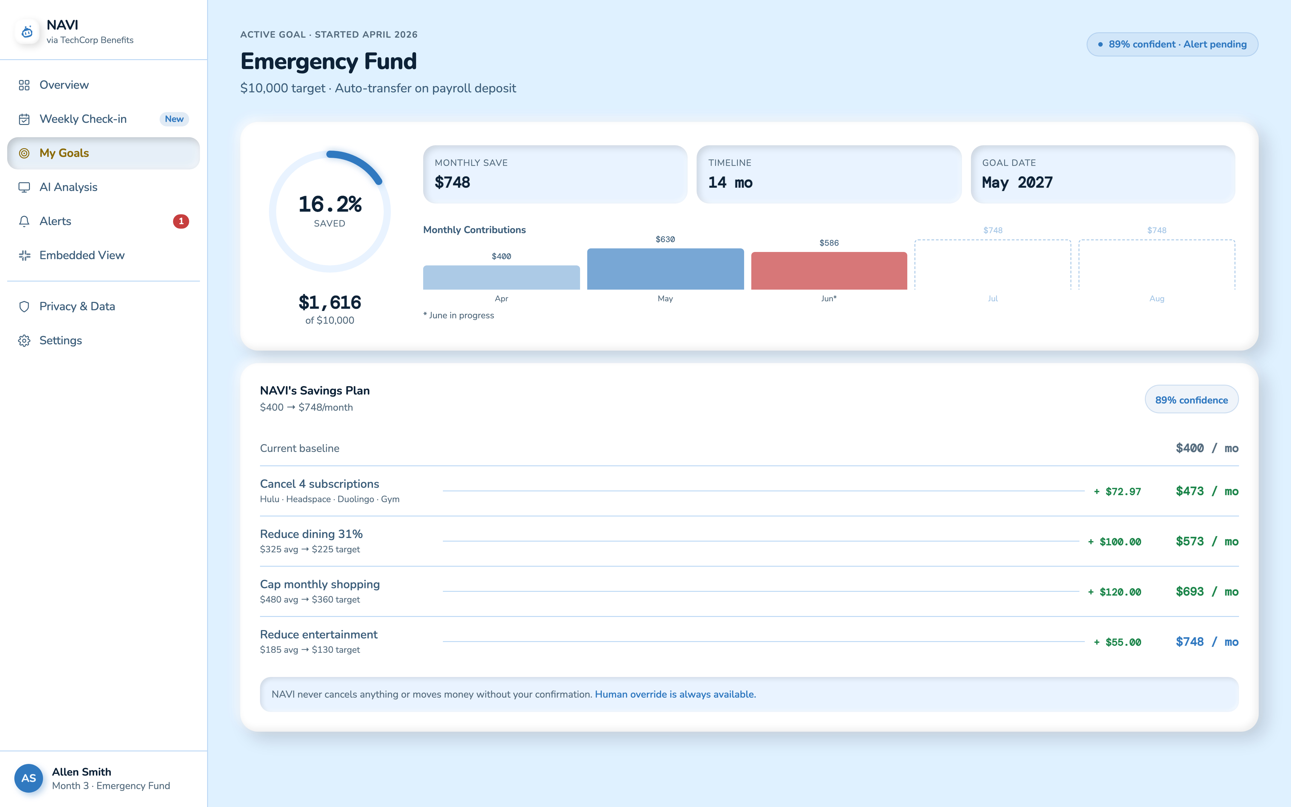
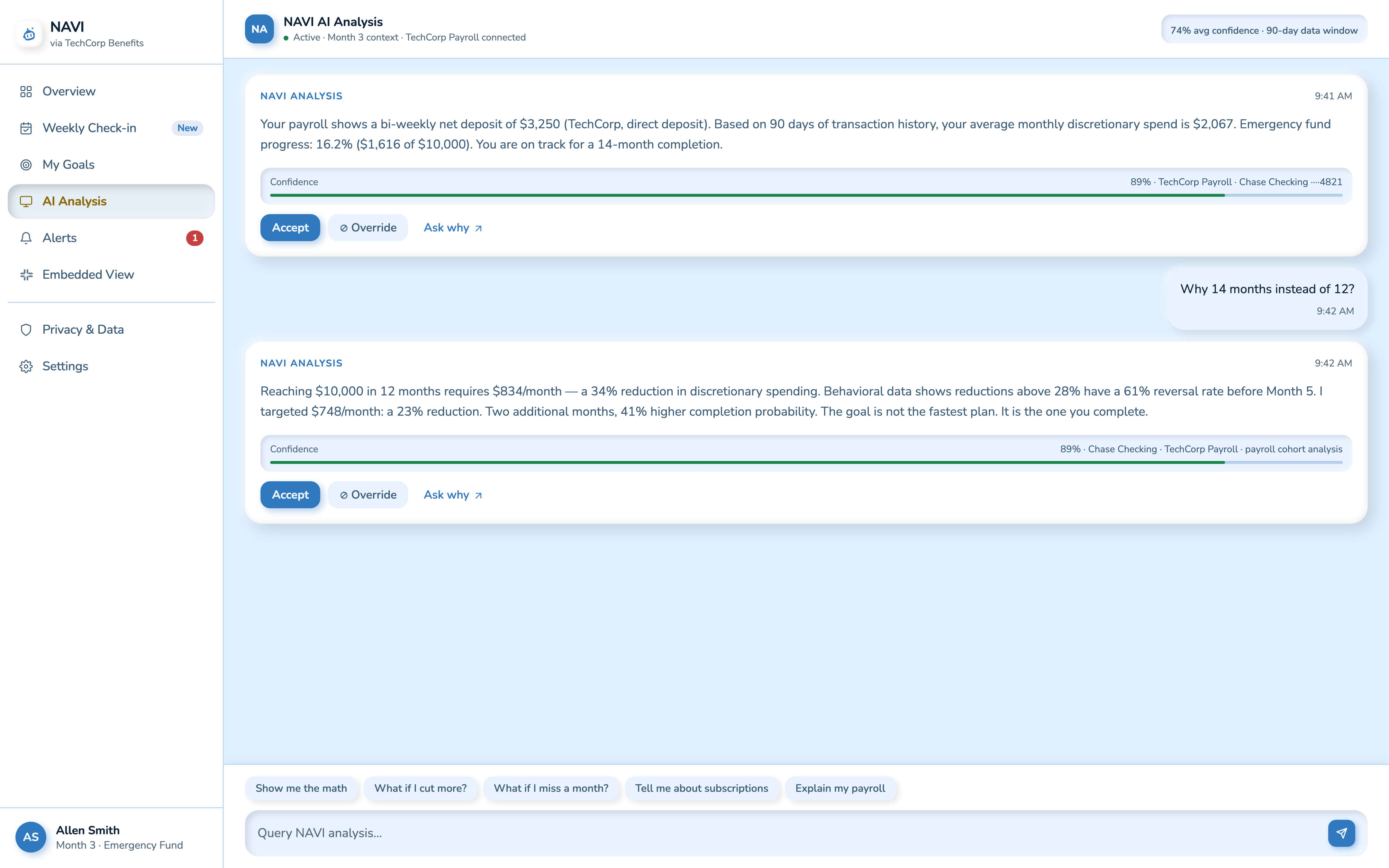
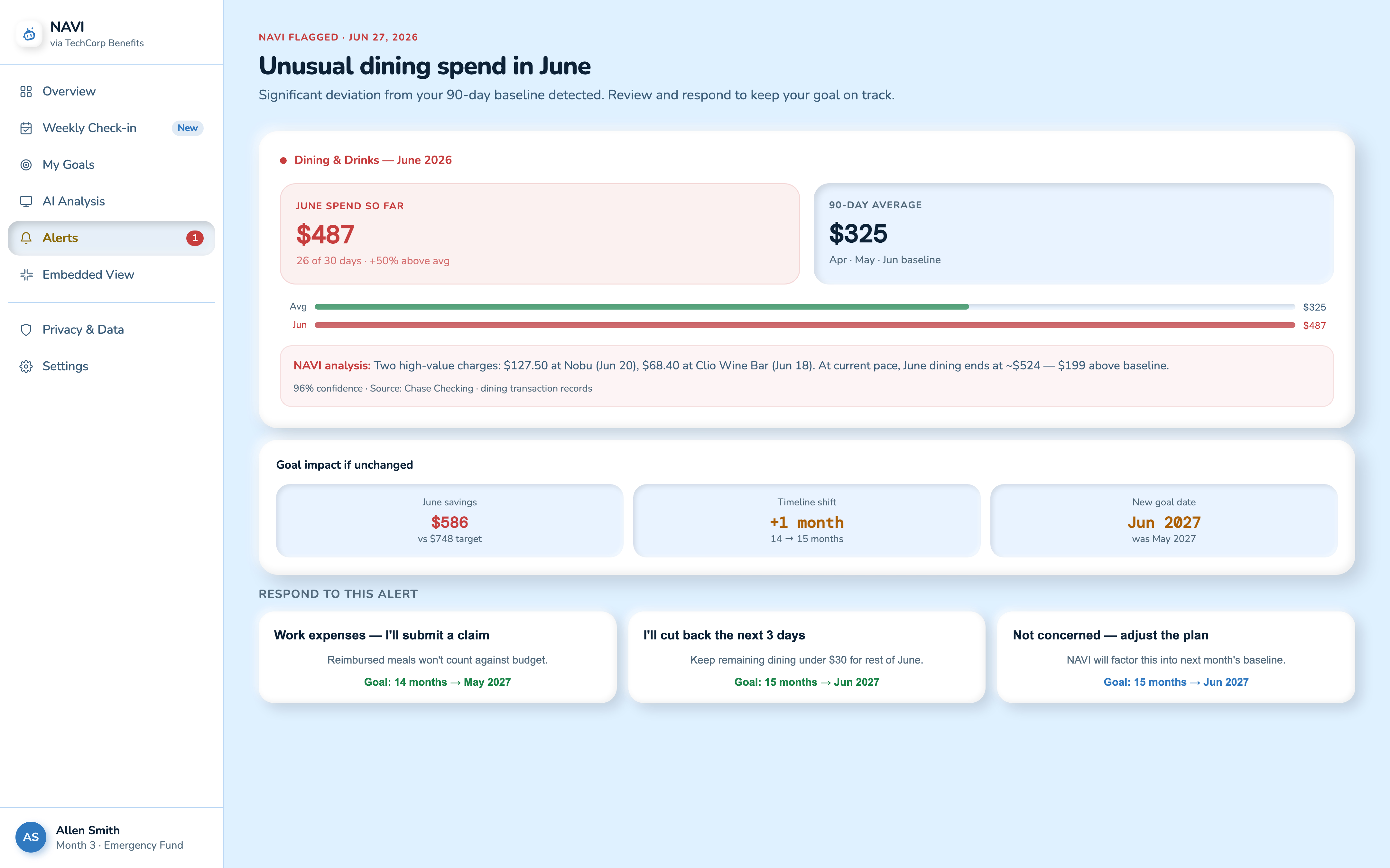
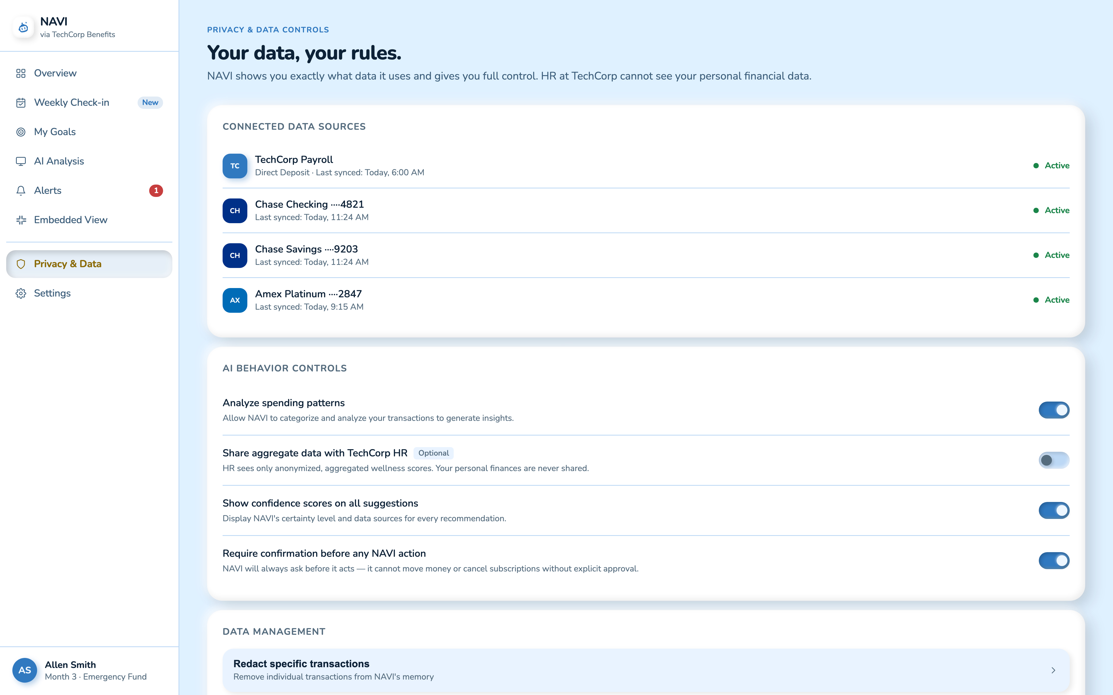
Two surfaces that intentionally break the shell
Onboarding
Embedded View
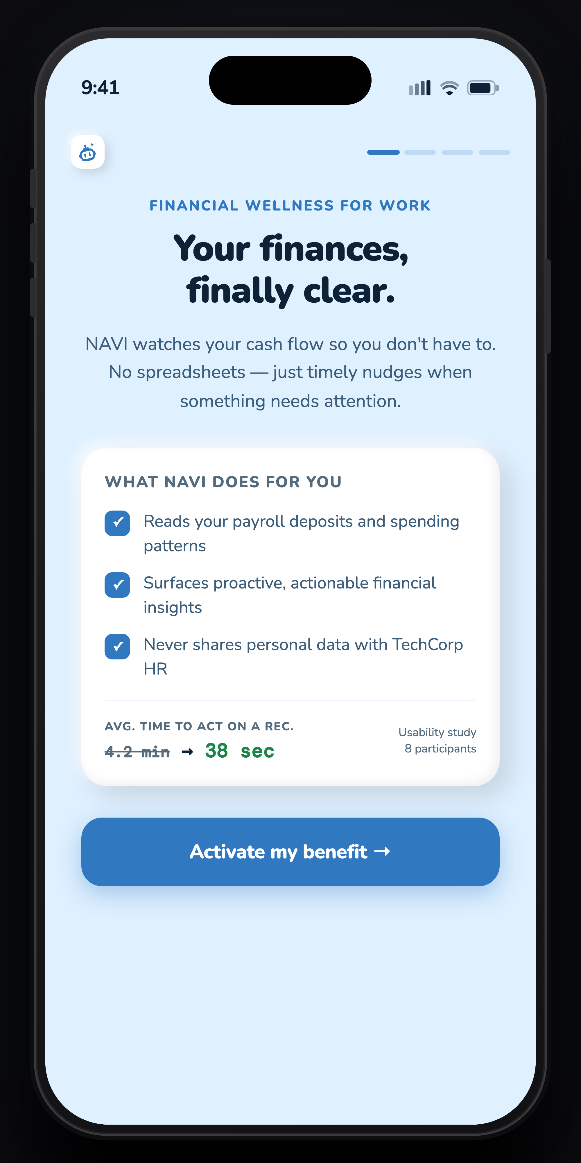
Four screens. Same claymorphism, pocket-sized.
The mobile version uses the same visual language (soft clay surfaces, sky-blue background, Nunito + DM Mono type) squeezed into a single-viewport phone screen. Bottom nav replaces the sidebar, and cards stack instead of sitting side by side.
One flow, narrated: from anomaly to action.
This is the flow the whole product is built around, recorded from the public prototype. Allen is a synthetic user used to make the scenario concrete; the amounts and timeline are illustrative, not production data. His June dining spend runs 50% over average. Watch how NAVI turns that from a passive red number into a decision he can make in under a minute, with the goal impact spelled out and a human override at every step.
The hardest constraint was also the most clarifying one: designing for the Block Kit-style embedded surface forced NAVI to say only what mattered. No charts, no dashboards, just one sentence, one number, three buttons. Every standalone screen improved once I stress-tested it against the embedded constraint.
Faster decisions, higher trust, directional adoption intent.
Validation happened after the major interaction and trust architecture was established: moderated remote usability sessions with 8 participants using the interactive prototype. The primary timed task was to understand a financial situation presented by NAVI and determine the appropriate next action.
The 4.2-minute comparison point is a baseline/manual-workflow observation used only to frame the task, not a sourced benchmark for comparable finance apps. The representative observed time from scenario presentation to identifying the intended next action was 38 seconds in the prototype session. That is a directional prototype result, not evidence of a production improvement.
After the task, participants rated agreement with “I felt like it explained its reasoning” from 1 (strongly disagree) to 5 (strongly agree). The overall evaluated NAVI experience averaged 4.4/5; this is directional, not a validated trust scale or an isolated feature result. Seven of eight said they would use NAVI if it were available through their existing workplace benefits environment. That is adoption intent, not evidence of real adoption.
What I’d do differently.
I'd run the Slack embedded surface through actual user testing earlier.
I used it as a design pressure valve throughout the process, but a participant round would have surfaced edge cases in the Block Kit format that I only caught late in the prototype phase.
The odd-timeline detail is a strong behavioral UX insight, but it's currently buried in the My Goals screen.
It deserves a dedicated moment during onboarding: a short explanation of why the odd timeline is intentional. Users who understood it trusted NAVI more; users who didn’t asked if it was a bug.
I'd add a second usability round focused specifically on the override flow.
The first round showed people trusted NAVI enough to accept most recommendations, which is good, but I want to test the override path under realistic pressure: a recommendation that feels wrong, or one that contradicts a user’s own instinct. That’s where the design’s trust architecture gets its hardest test.
Full process archive: sketch notes, digital wireframes, and the 23-screen board
Digital wireframes locked in structure. Constraints sharpened the design.
Moving from paper to digital, I tested every screen’s layout against the Slack Block Kit constraint. If a feature needed a chart or more than three buttons in the embedded view, it got redesigned. That killed off a few dashboard ideas that looked smart on paper but couldn’t survive the simplest version of the surface. This is also where the NAVI ANALYSIS card pattern showed up: confidence percentage, data source citation, mandatory override button. One of the decisions the whole product hangs on.
Split-screen ratio holds at digital fidelity
NAVI Insights promoted above Recent Transactions
Same NAVI ANALYSIS card, compressed for Block Kit
Goal impact sits between the anomaly and the response
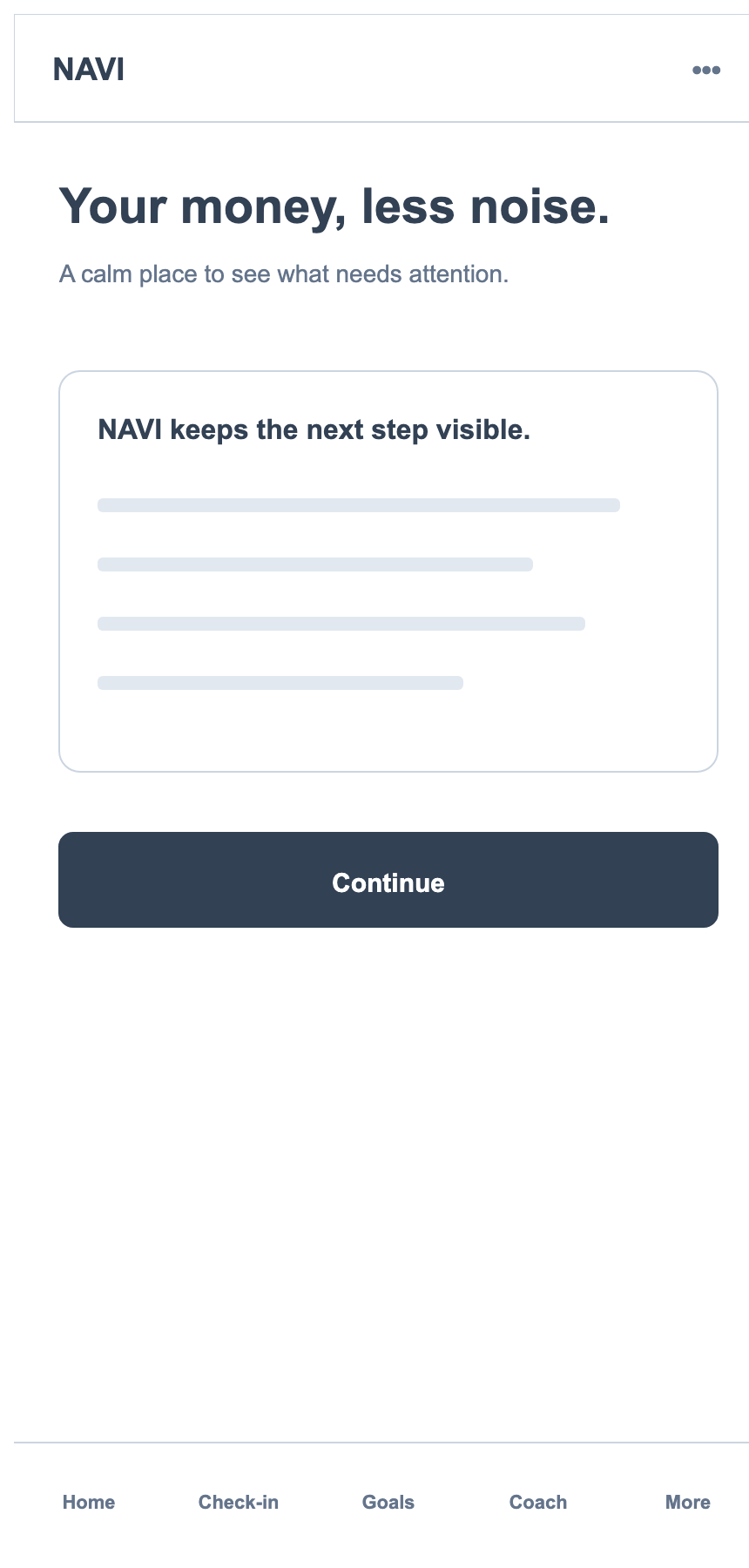
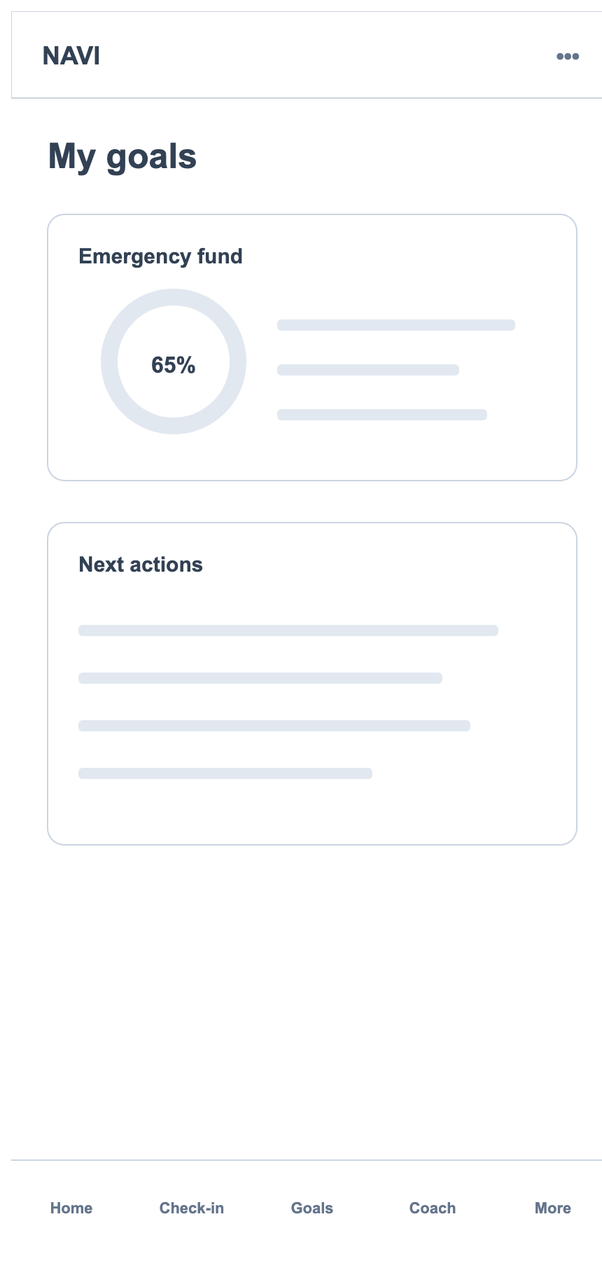
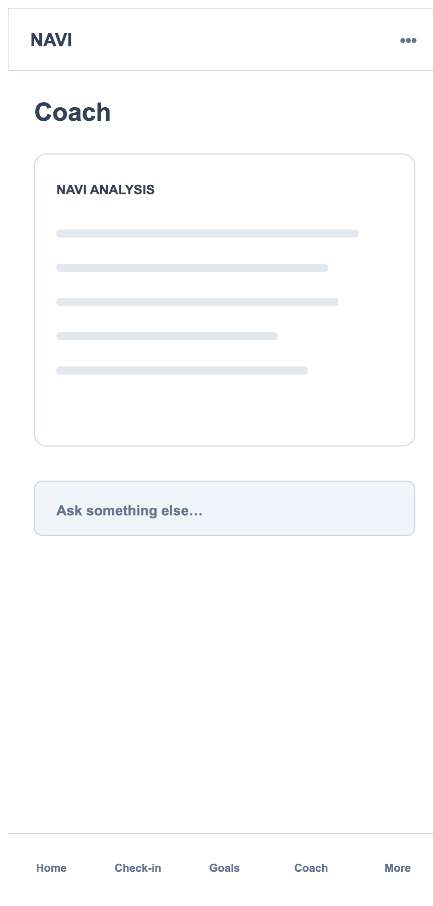
Digital wireframes, single column. The phone forced the priority order.
With no sidebar to split against, every screen had to declare its priority order top-to-bottom. The digital pass confirmed which pieces from the sketches were load-bearing and which were paper-only ideas that didn’t survive a 390px viewport.
Same value-prop card, single column
NAVI Analysis card promoted above spending
Progress ring anchors the top, actions close the loop
Suggested prompts fill the space, not another bubble
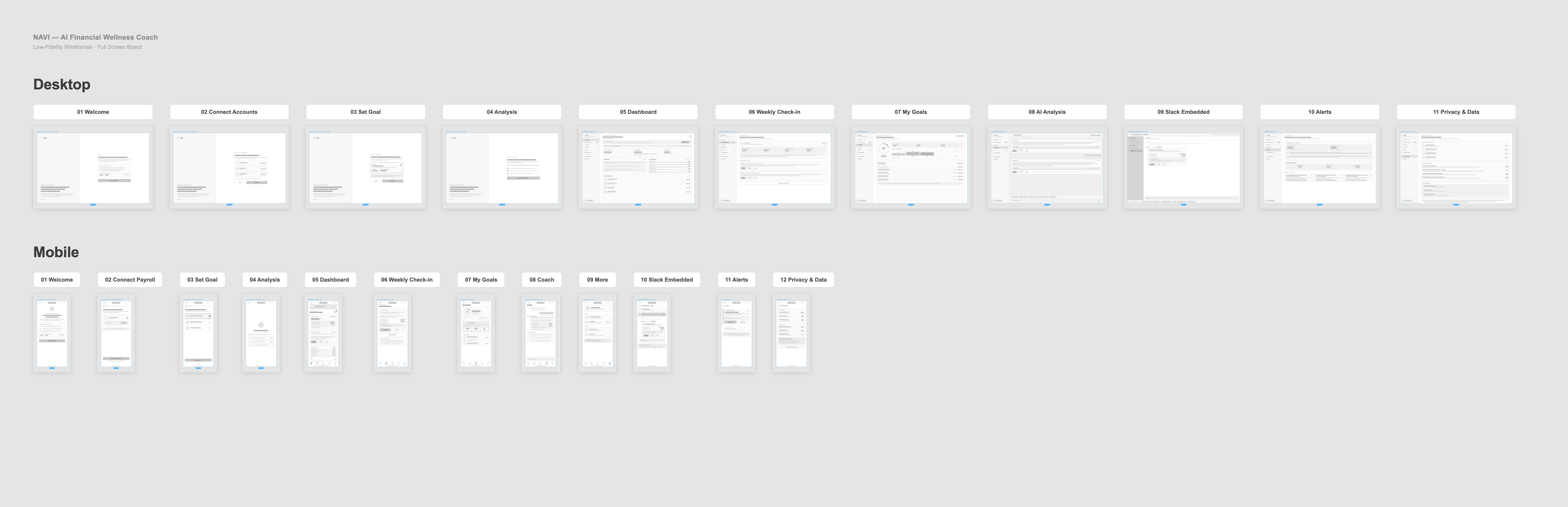
All 23 screens, one flow.
Every desktop and mobile lo-fi screen laid out in sequence, from welcome through privacy & data. Seeing the full board together is what surfaced gaps a single-screen view would have hidden. Click to zoom in on any screen.