AI Product Design · Fintech · 2026Client · NDAResearch · Interaction · PrototypeCitation UX · Trust
Testimonium, an AI that refuses to lie to you.
Product design for an AI research assistant that gives analysts page-grounded answers, visible evidence, and a clear refusal when a filing cannot support the question.
Product DesignerResearch · AI Interaction Design · Prototyping · Implementation
- 100%
- citation accuracy, verified with analysts
- <30s
- time to first answer
- AA
- WCAG 2.1
- Cited to the exact page
- Correct units, always
- Says 'I don't know' instead of guessing
“Every cited page contained the quoted text. No false citations, across the realistic analyst questions we tried in the final verification session with the same analysts from discovery.”
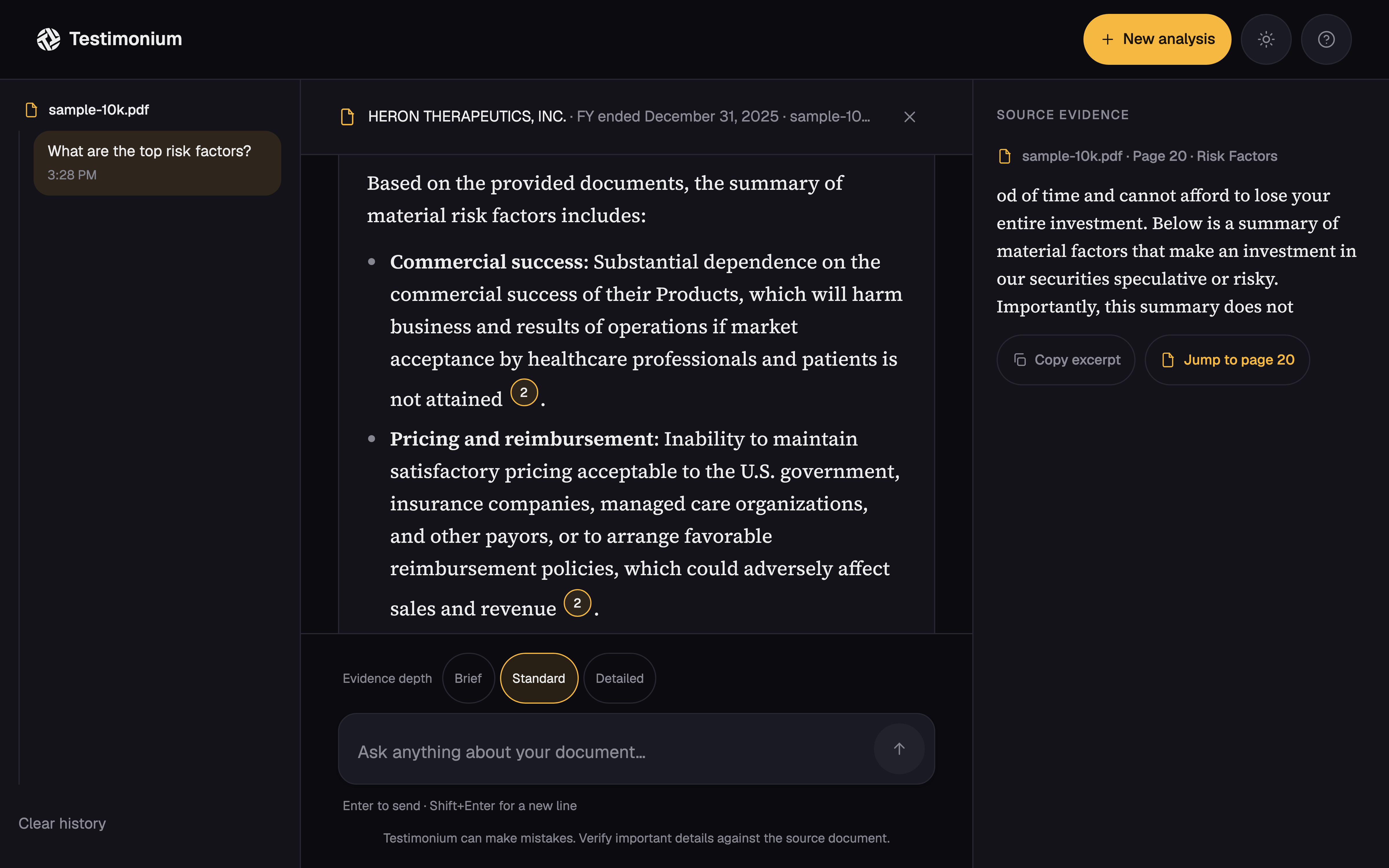
Designing an answer analysts could trust enough to use.
Testimonium is an AI research assistant for SEC filings. The design problem was not simply how to generate an answer; it was how to make the answer inspectable, page-grounded, and honest when the filing could not support it.
The business context was an equity research team evaluating SEC filings. Analysts were spending roughly 6–8 hours per week on the hunting and stitching work; this project does not claim a separate ROI calculation.
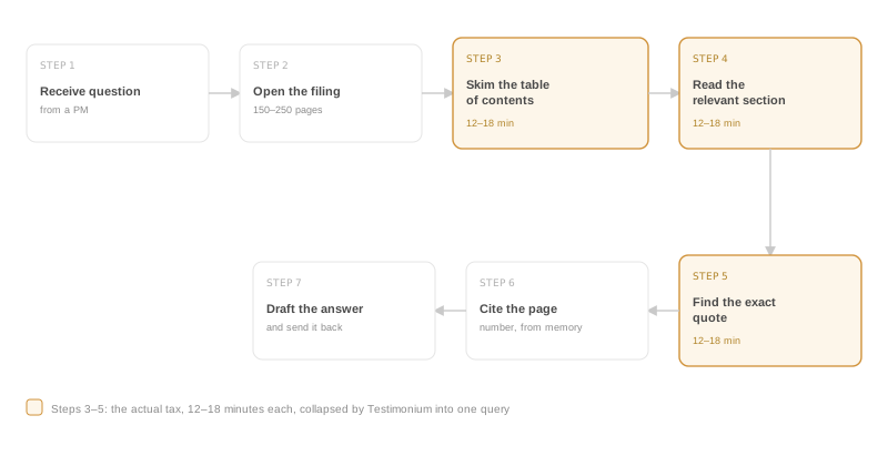
Discovery started with two days of shadowing and five analyst interviews. Their seven-step workflow had three hunting steps that each took 12–18 minutes. That made the product question concrete: replace the hunting and stitching work with an answer that carries its receipts, without asking analysts to lower their standard of proof.
My ownership covered discovery, problem reframing, the interaction model, the answer-with-citations experience, confidence and trust mechanisms, the interface and visual system, prototyping, and validation with analysts. I designed and built the experience end to end so the design promises could be pressure-tested against real technical constraints.
Two days of shadowing before a single screen got designed.
The discovery work mapped the actual analyst workflow instead of starting with a feature request. The same analyst group later participated in final verification.
- 01
Nobody wanted a summary
Analysts wanted evidence with a chain of custody back to the actual filing. The answer needed to support their judgment, not replace it with the tool’s opinion.
- 02
No page number, no deal
A page citation was mandatory. If the tool could not point to the exact page a claim came from, the answer was not useful no matter how polished it sounded.
- 03
Tables needed their own trust boundary
Financial statements needed conservative handling. Ambiguous table structure could not be quietly turned into confident-looking rows, so the interface had to keep the extracted evidence and its limits visible.
I almost built a smarter Cmd+F. That would have missed the point.
The rejected direction was a search overlay for PDFs: better ranking, more useful snippets, the same basic job. It was still asking analysts to stitch scattered mentions together by hand.
Rejected direction
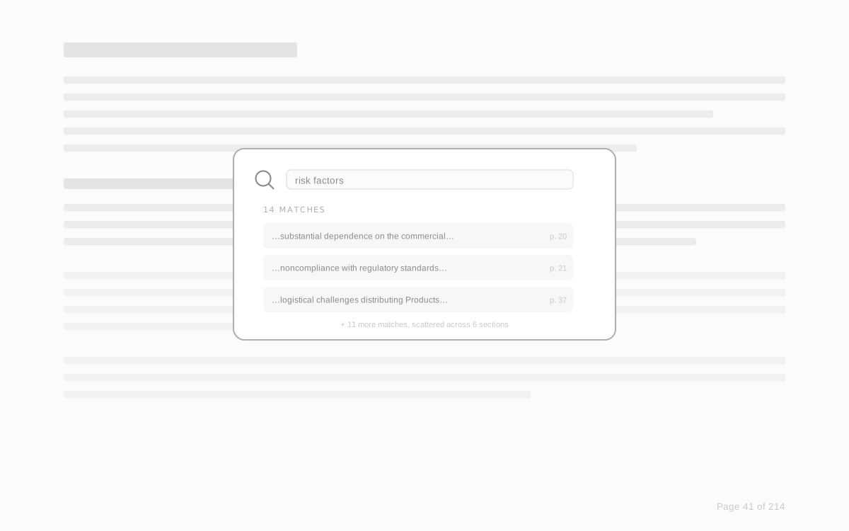
The problem was not finding one phrase. It was turning several passages into one answer and showing why that answer deserved attention. The design moved from “better search” to “answer with receipts.”
The tool should answer the question and show its work, the same way an analyst would if you asked them directly.
Trust was the actual UX problem, not a backend detail.
The interaction model made trust visible at the moment an analyst needed to decide whether to keep reading.
- 01
Confidence before the answer
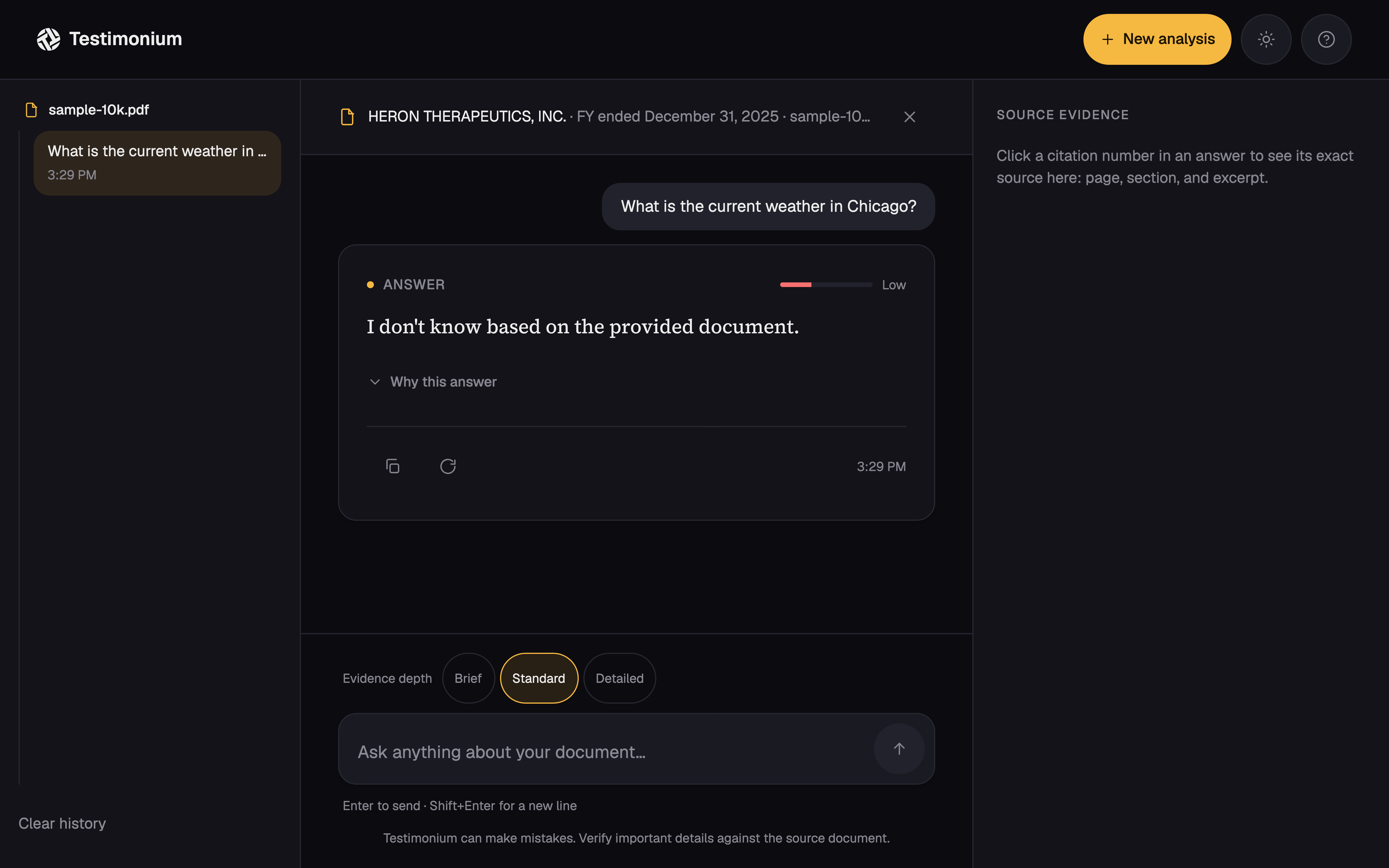
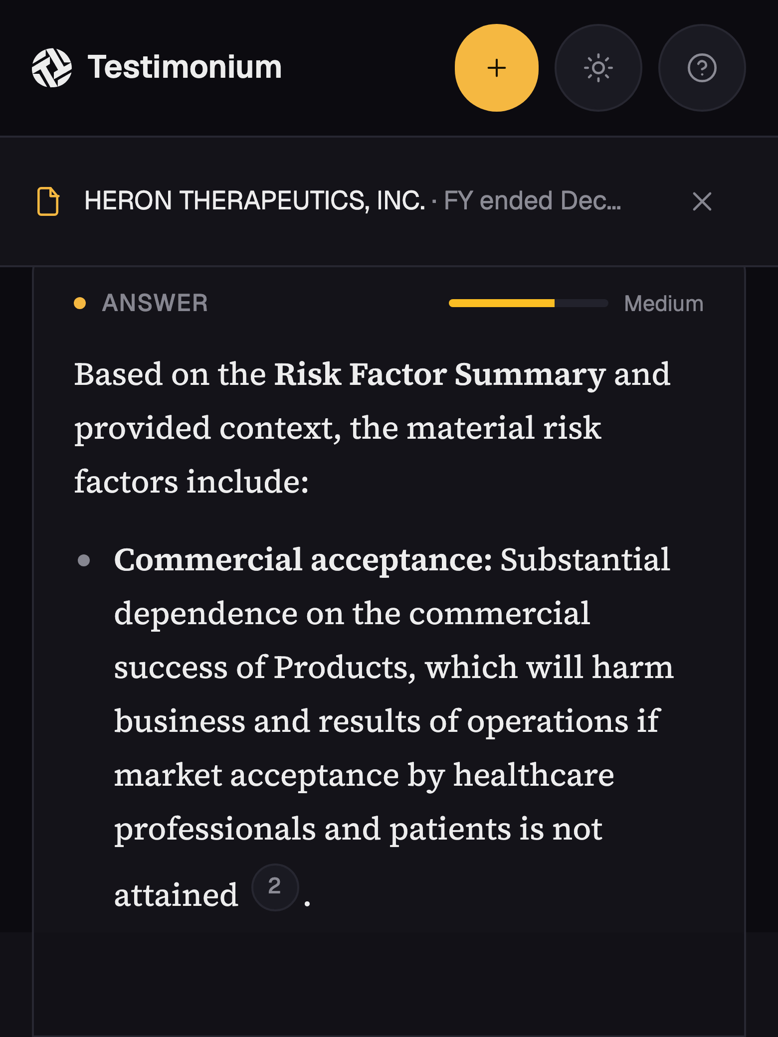
High, Medium, or Low appears before the answer text. The badge is calculated from retrieval scores, but a refusal always drops to Low with no citations, regardless of the underlying scores. A refusal never gets dressed up as a confident answer.
- 02
Citations attached to claims
Every claim carries a numbered chip. Opening it reveals the exact excerpt, page number, and section heading in place, so the analyst does not have to leave the answer to check the source.
- 03
An evidence panel that stays put
The inline drawer is useful for one claim. The desktop evidence panel keeps the last selected citation visible during comparison, including the excerpt, page, section, and a link into the uploaded PDF at that page.
- 04
A reading interface, not a dashboard
Answer text uses a serif face while controls and chrome use sans. The 14px UI base leaves the interface compact; anything meant for close reading gets larger and looser. The distinction tells the reader what to operate and what to read.
- 05
Tables with an explicit source trail
Primary financial statements remain a separate evidence type. A compact table can be useful, but its statement title, period columns, page, and source excerpt remain inspectable when the layout is ambiguous.
From wireframe to an answer with receipts.
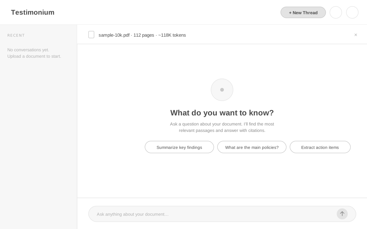
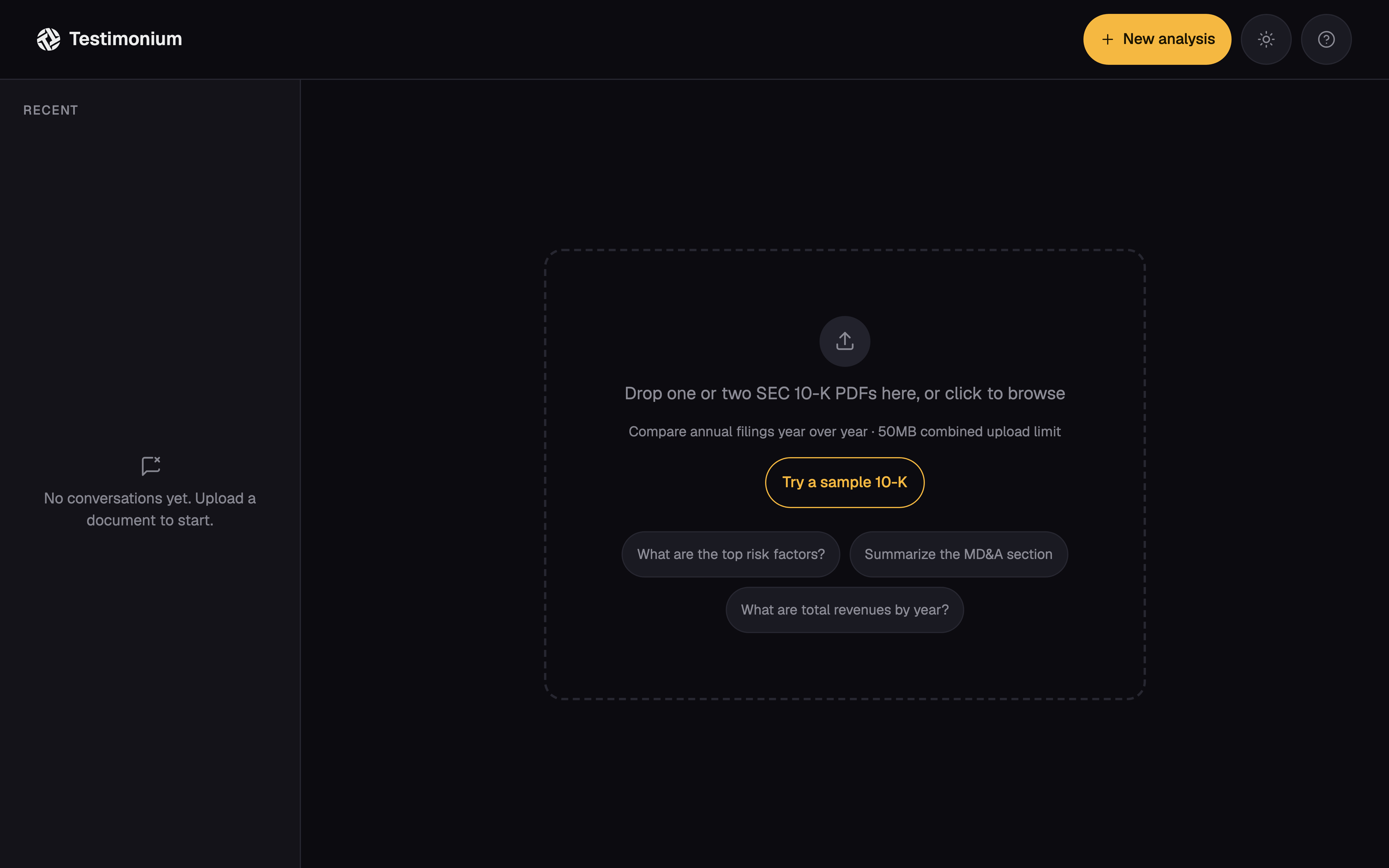
The single-filing layout stayed stable through prototyping: document context, a prompt when there is no answer yet, and one answer card per turn. The visual work made the trust model legible without changing the underlying reading flow.
Document workspace
Lo-Fi
Final UI
Conversation and citations
Lo-Fi
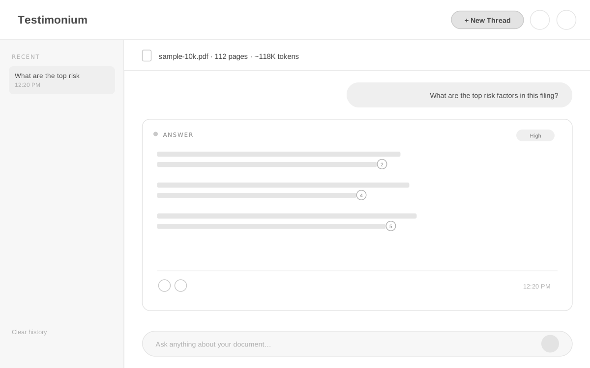
Final UI
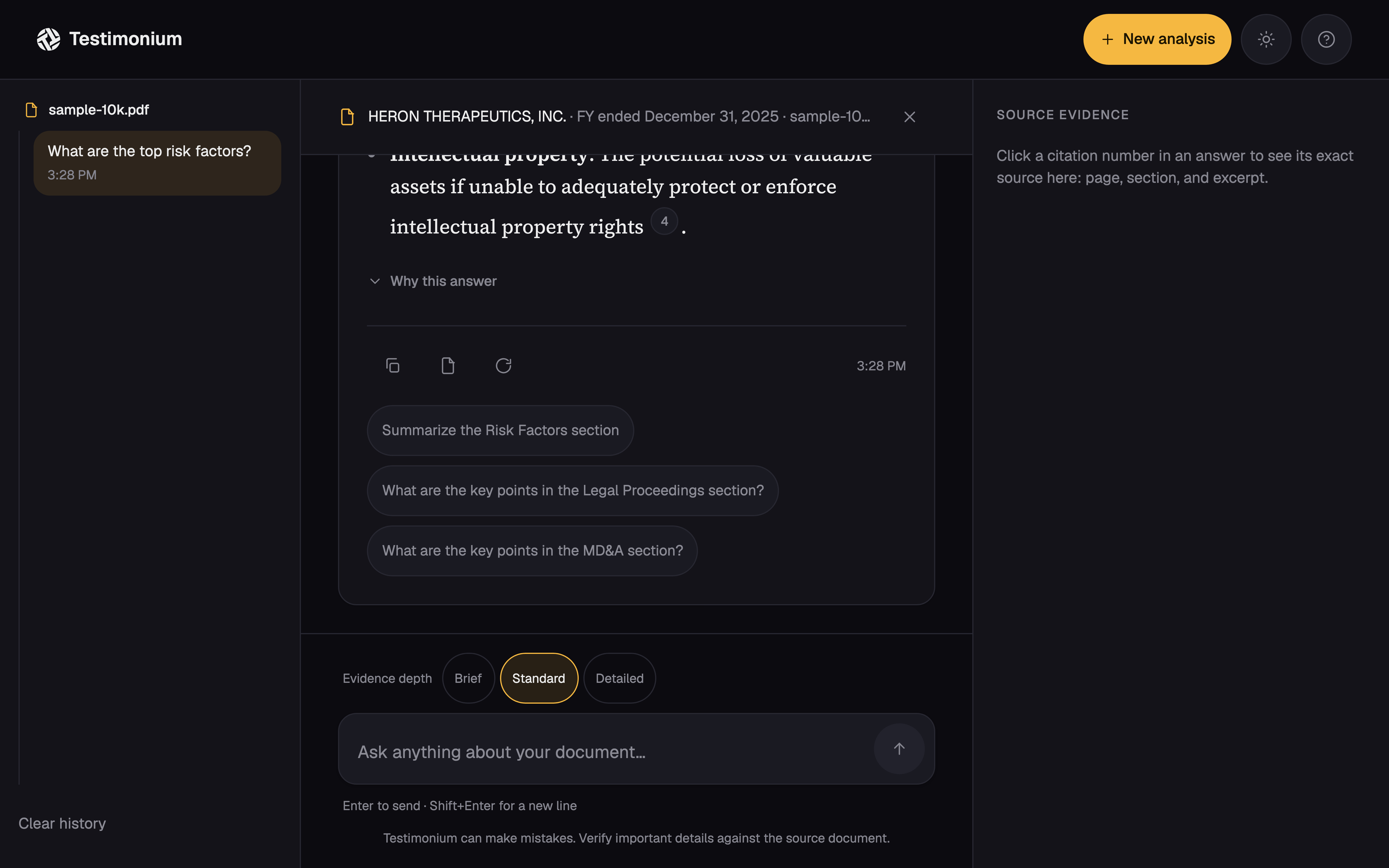
Every part of the answer traces back to a design decision.
The annotated answer shows how discovery became interface: confidence first, citation beside the claim, and actions that support checking without forcing a full re-ask.
- Confidence label, not a raw score. High, Medium, and Low give the analyst a usable reading signal before the answer reveals.
- Citation chips sit inside the sentence. A claim without a page number is not complete, so the receipt stays next to the claim.
- The evidence stays available. The drawer and panel let an analyst check a specific answer without losing the research context.
Retrospective: from workflow tax to answer with receipts.
The retrospective makes the design change explicit: the old seven-step workflow put the time cost in three hunting steps; the new flow moves that work into a cited answer an analyst can inspect.
Old workflow
- Receive a research question
- Open the filing
- Find the relevant section12–18 min
- Hunt for the supporting passage12–18 min
- Reconcile scattered mentions12–18 min
- Copy the answer into an email
- Type the page number from memory
New answer-with-receipts flow
- Upload the filing
- Ask a realistic research question
- Read the answer with its confidence signal
- Open the citation chip beside the claim
- Check the exact excerpt and page
- Forward an answer with its evidence
Retrospective portfolio visualization based on the verified Testimonium narrative, not an artifact from the original discovery.
Retrospective
The design promises also had to map to mechanisms the product could actually explain.
| Design promise | How the system backs it |
|---|---|
| Confidence badge | Retrieval scores plus a refusal rule: refusal always drops to Low with no citations. |
| Citation chip | A chunk-to-claim parser maps each [n] to its source chunk. |
| Evidence panel | Redis session storage plus a link into the reader’s uploaded PDF at the cited page. |
| Refusal | A thin-evidence threshold drops confidence to Low with no citations. |
Retrospective mapping from the existing Testimonium narrative.
Implementation as proof, not a competing identity.
I designed and built the experience end to end to test whether the product promise could survive real technical constraints. The implementation is evidence that the design was pressure-tested, not a second identity for the case study.
- 01
A reliability bug can look like a product limitation
A plain in-memory store scoped to one serverless instance meant an upload and the next query could land on different processes. The query found an empty store and returned the fallback immediately, reading like a document limitation when it was actually Vercel routing two requests to two different processes. Moving to Redis fixed it. The lesson is a trust story: reliability failures can masquerade as product limitations, exactly the kind of thing that erodes confidence in an evidence product.
- 02
Model-retirement handling is part of the promise
The model used during development was retired mid-project and began returning 404s. Switching to the
latestalias restored the endpoint, with an honest tradeoff: an alias can change quality without warning. A versioned contract and smoke eval catch regressions. - 03
The citation pipeline makes the promise real
Retrieved chunks go to the model. A parser maps each
[n]back to the exact chunk it came from. That is what makes the citation chips clickable and correct rather than decorative.
Pipeline evidence
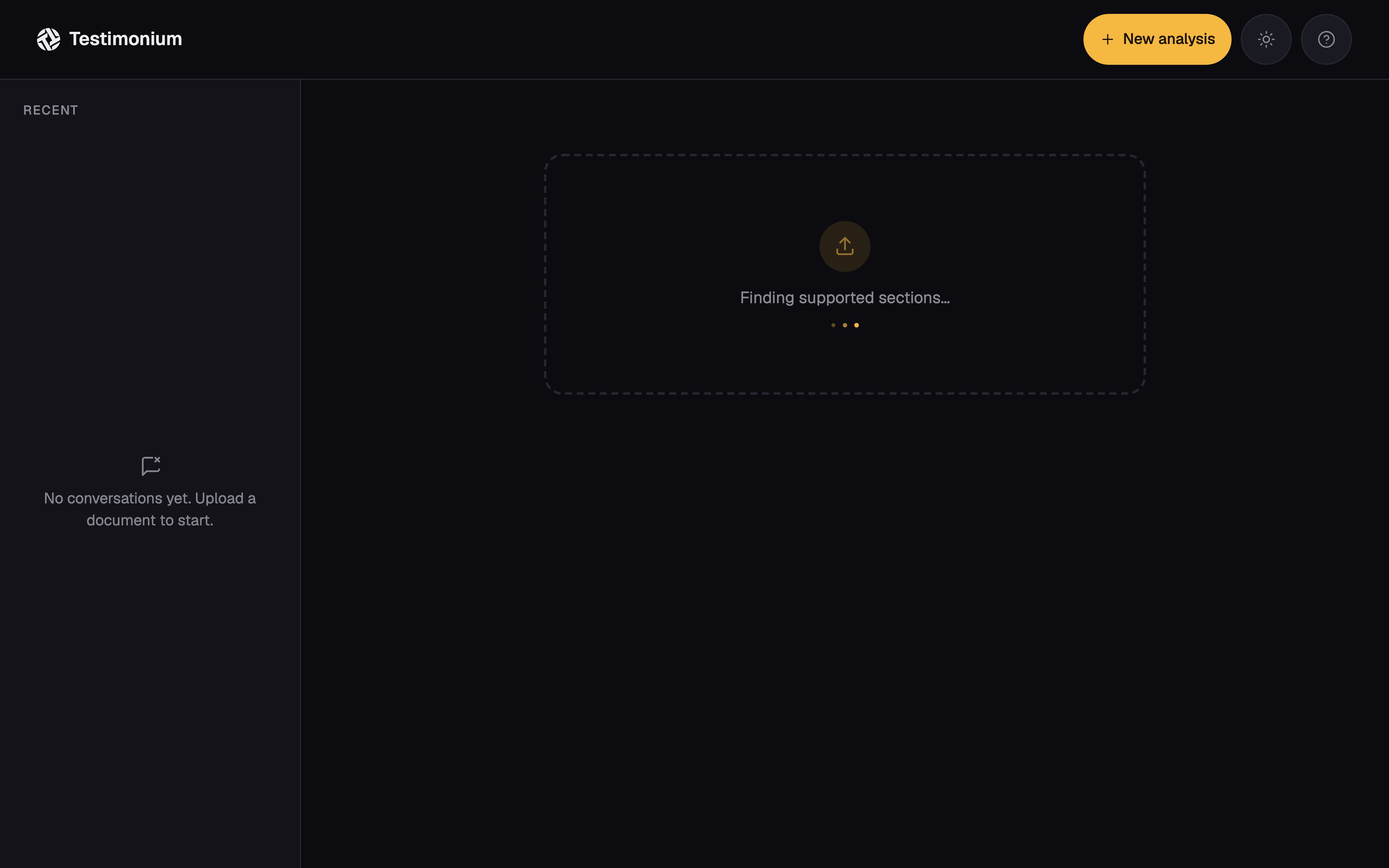
Pipeline evidence
The interaction bugs mattered because they changed trust.
The most relevant bug was not a backend detail. The citation drawer’s outside-click listener ran on mousedown, before the chip’s own click handler, so the same gesture could close the drawer it was trying to open. A time-bounded ref tracking what had just closed fixed the ordering problem.
That fix belongs in the design story because the interaction either preserved the analyst’s place or made the evidence feel unreliable. The implementation detail mattered because the user’s trust signal was a visible citation they could check.
The visual system treated contrast as a trust decision.
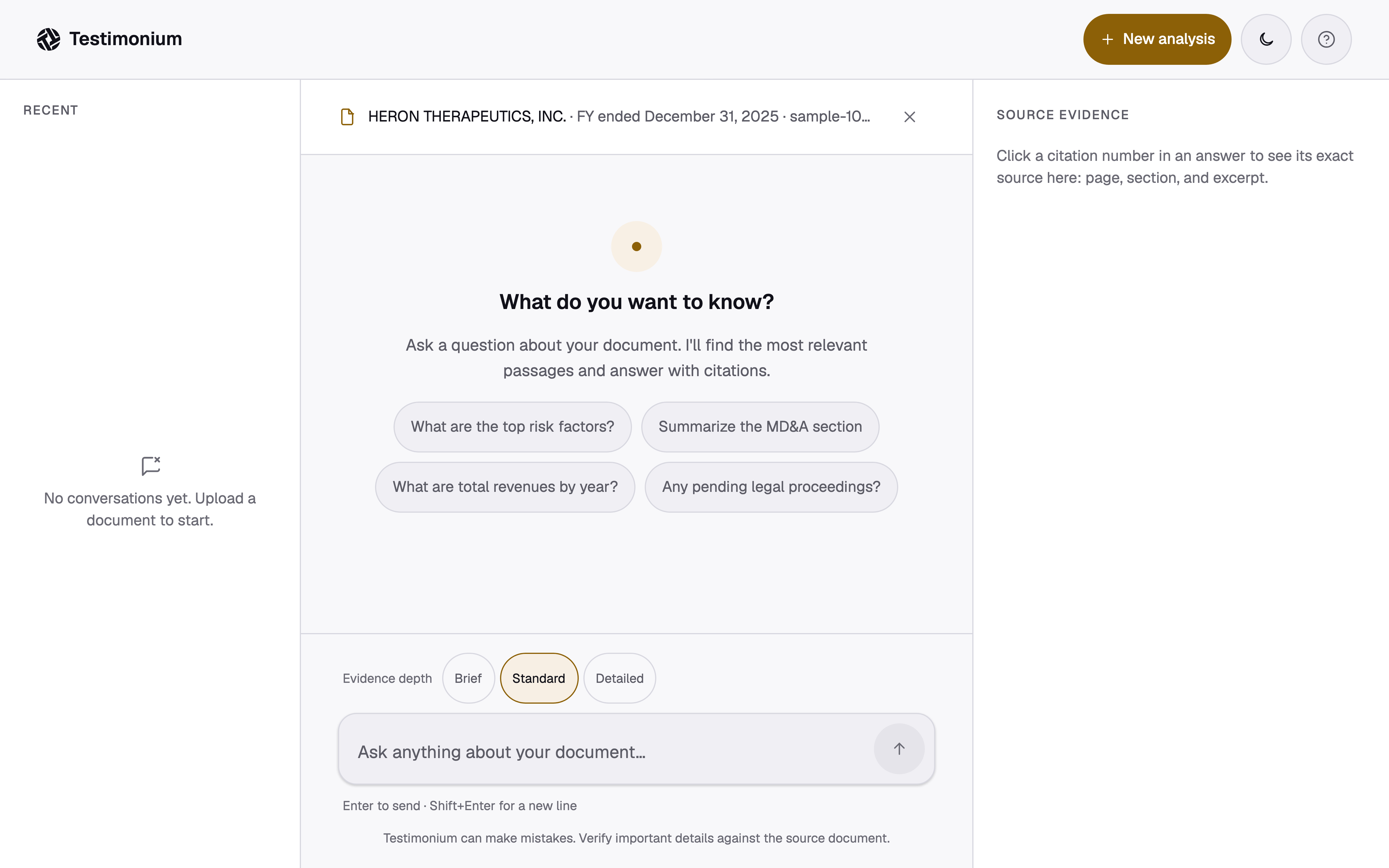
The system uses one amber accent split into two values so it passes contrast in both themes, a neutral graphite scale, and a two-typeface split: serif for answers and sans for chrome.
The original confidence-gauge amber failed at 1.55:1 against the 4.5:1 text target in light mode. Splitting the amber into a darker light-theme value and the original dark-theme value preserved the signal without asking color alone to carry meaning. The interface also keeps the confidence word visible and the citation relationship explicit.
Motion follows real pipeline stages: part upload, text extraction, chunking, indexing N/M chunks, streamed answer text, and a Stop control while generation is active. The progress display reflects completed work instead of a guessed percentage.
- AA
- WCAG 2.1 target, both themes
- 1.55:1 → 4.5:1
- Amber contrast, before and after the fix
- 44px
- Minimum touch target, every interactive control
- 0
- False citations across verification testing
Verification with the analysts who would actually use it.
Near the end of the six-week build, I ran a live, moderated verification session with the same analyst group from discovery. Each analyst used a filing relevant to their own coverage and asked realistic research questions, not artificial benchmark questions.
Every citation in the evaluated answers pointed to supporting source material when manually checked. That is what “100% citation accuracy” means here. One question could not be answered because the filing lacked the required narrative information; that surfaced a document limitation cleanly and was not a citation failure. Time to first answer stayed under thirty seconds on pre-processed documents.
Analysts checked the source drawer on the first answer and mostly stopped checking by the third. That behavioral change was the trust signal the design was trying to create.
Every cited page contained the quoted text. No false citations, across the realistic analyst questions we tried in the final verification session with the same analysts from discovery.
The final interface kept the evidence visible.
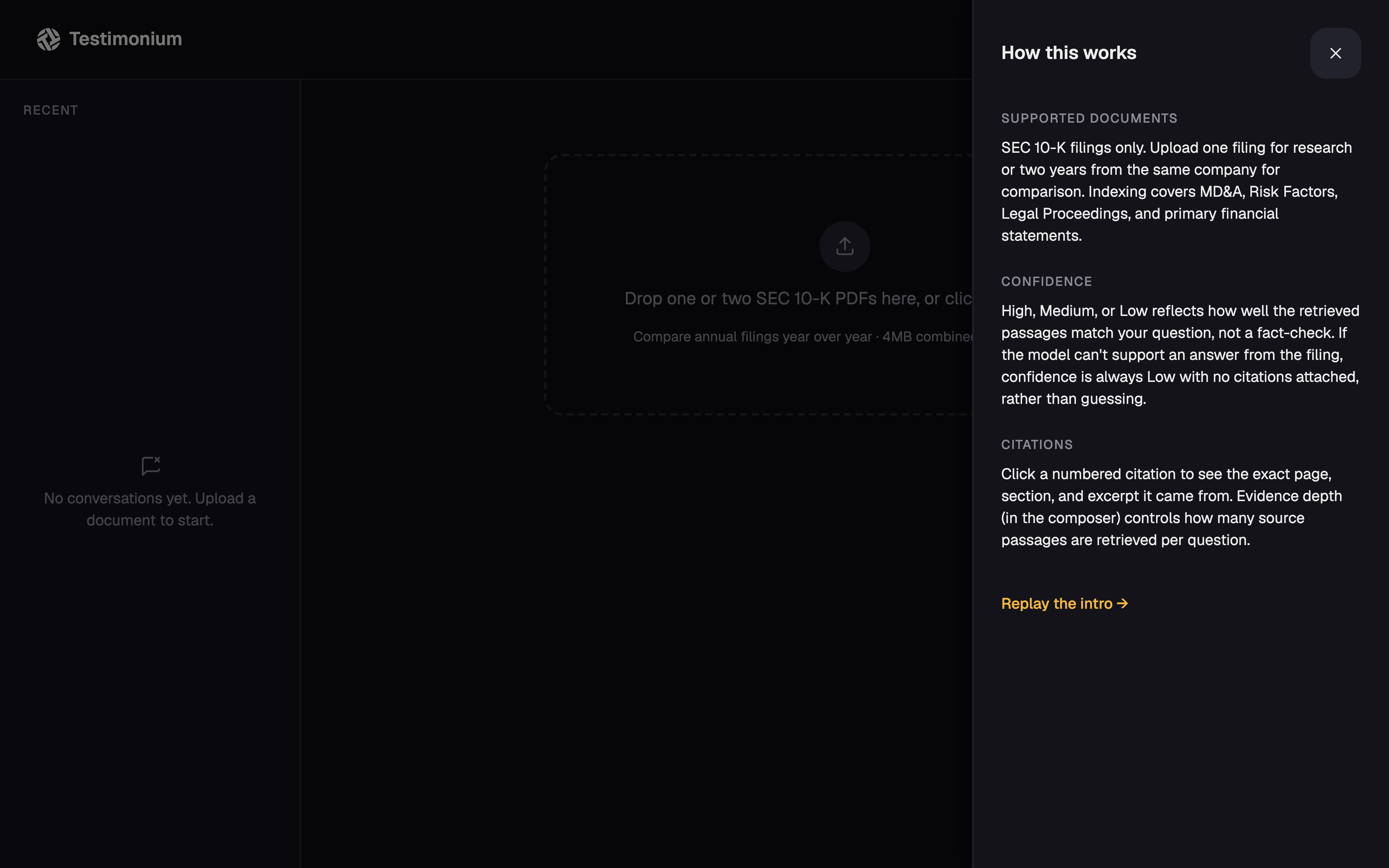
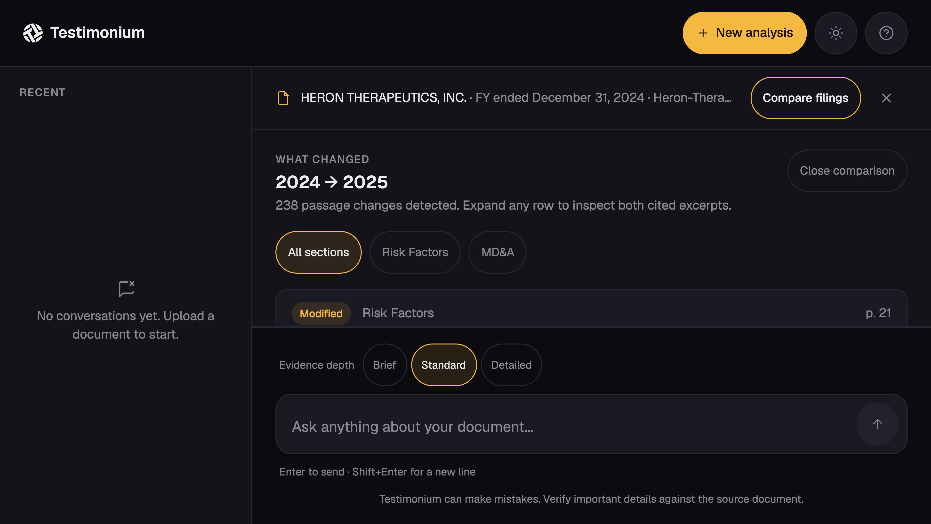
The live product supports ordinary Q&A, lower-confidence responses when evidence is thin, and year-over-year comparison without collapsing both filings into an unsupported summary.
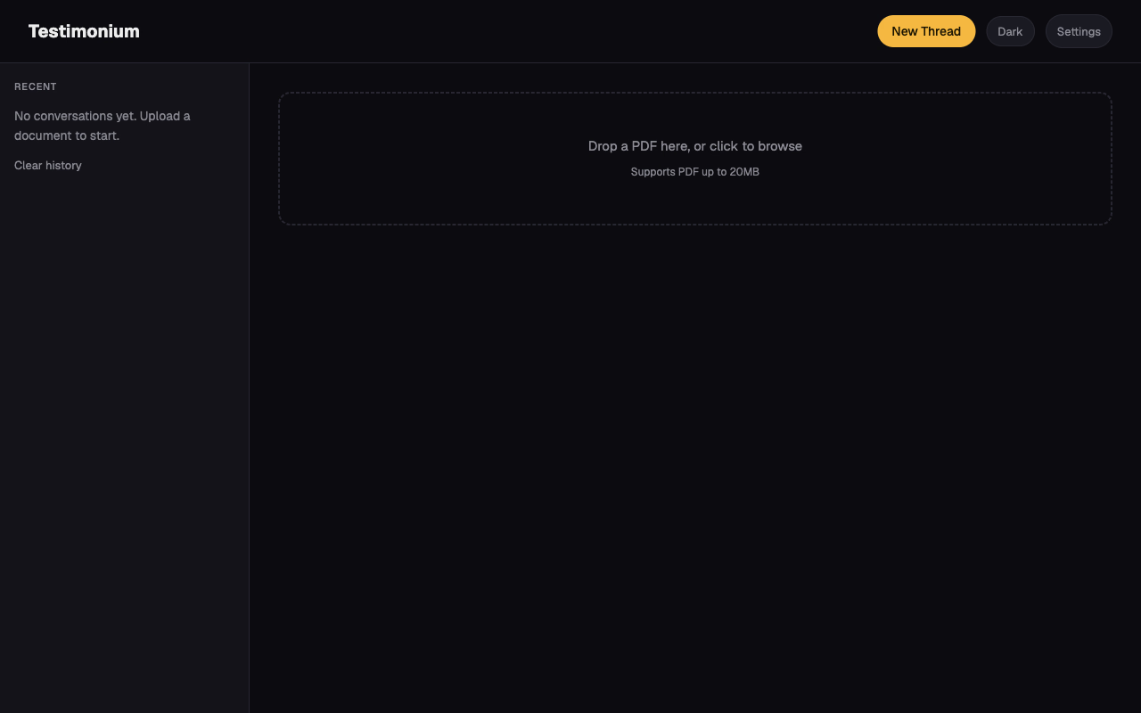
The interface before the design pass.
The original interface was functionally complete, but plain. The redesign kept every piece of underlying logic and rebuilt the interface layer on top of it.
Before redesign
Interested in the implementation? View the engineering repository.